Properties - Appearance - Carousel Settings, Dropdown Styling
Each container mode has its own set of Appearance settings, so the settings in this article will only be displayed when you select the correct container mode. For more information about container modes, please see our article here.
To display the settings for Carousel container mode, select Tabs as your Container Mode in Container Settings. To display the Dropdown Styling settings, select the Dropdown container mode.
This topic contains the following sections:
Carousel Arrows
With Carousel Arrows settings (Figure 1) you can enable arrows to highlight data in the chart. You can embed Arrows inside the container, set the Arrows Margin, choose a custom Arrows Icon, and Arrow Bottom.
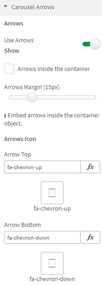
Figure 1: Carousel Arrows
You can also set the Arrows Color, Hover Arrows Color, the Arrows Opacity and the Arrows Size.
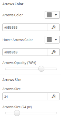
Figure 2: Arrows Color, Size
Carousel Indicators
When you enable carousel Indicators (Figure 3), you can choose a custom Indicators Icon, Indicator Color, Active Indicator Color, Indicator Opacity, and Indicator Size.
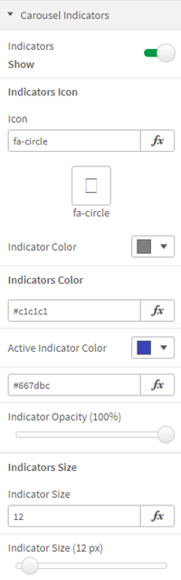
Figure 3: Carousel Indicators
Carousel Slide Show
When you enable the carousel Slide Show (Figure 4), you can set the Switch Time for each slide.
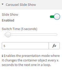
Figure 4: Carousel Slide Show
Dropdown Styling
When you choose a dropdown container mode, you'll open the Dropdown Styling settings (Figure 5), where you can choose the style of Background Color (this example uses Gradient styling), Gradient Color (Start), Gradient Color (End), Font Color, Font Size and Font Style.
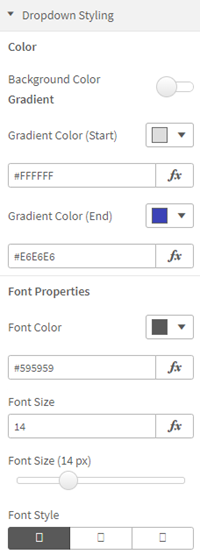
Figure 5: Dropdown Styling
You can also choose a Border Style (Figure 5), choose a Border Color and Border Thickness.
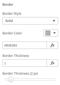
Figure 6: Border