Properties - Appearance
The Appearance settings help you to control the look and feel of your Vizlib Line Chart.
This topic contains the following sections:
General
In the General settings (Figure 1), you can enter a Title, Subtitle and Footnote. You can also choose to Toggle off hover menu and Show details to display information about dimensions and measures in your chart.
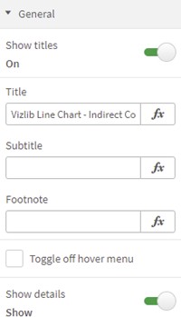
Figure 1: General
Data Gaps and Grid
In the Data Gaps and Grid settings (Figure 2), you can select an option for displaying Data Gaps, select your Grid Settings display with Show Grid, Horizontal Grid Lines: Show and Vertical Grid Lines: Show, set your Grid Style, Grid Color, Grid Opacity and the Grid Horizontal Thickness and Grid Vertical Thickness.
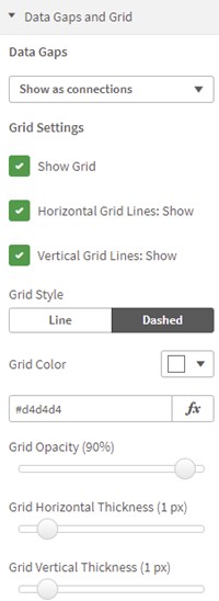
Figure 2: Data Gaps and Grid
Background
In the Background settings (Figure 3), you can choose the Inner Background and control the Stripes Orientation for striped inner backgrounds, setting an Even Color and Odd Color, select the Opacity and choose a theme for the Outer Background.
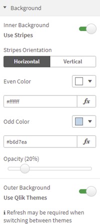
Figure 3: Background
X-axis
If you choose to Show an X-axis (Figure 4), you can choose:
-
a Timeaware Axis,
-
to set the Dimension Labels Position, to Horizontal, Angled or Vertical,
-
to add the option to Preserve edge ticks if you find that not all the ticks on the x-axis are displayed,
-
and to select a Font Color and Font Size.
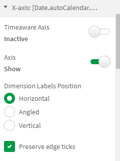
Figure 4: X-Axis
You can also set a Dimension Title (Figure 5), by entering a Label, Color, Label Font Size, and Label Font Style. You can also set the Axis Line Color and Axis Thickness.
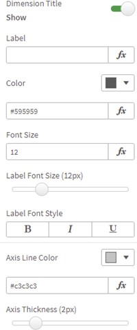
Figure 5: Dimension Title, Axis
Y-axis
If you choose to Show a Y-axis (Figure 6), you can choose a Color, Font Size, display a Dimension Title, enter a Label, set the Font Color, Label Font Size and Label Font Style.

Figure 6: Y-Axis
You can set the Axis Line Color (Figure 7), Axis Thickness, and customize Auto Ticks, selecting an Auto Tick Format, and choosing a display setting for a Negative Format. You can also choose an Axis Range with min/max smoothing to round off your start and end values to a whole number.
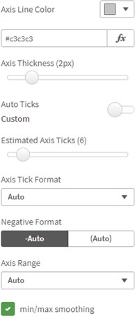
Figure 7: Axis, Ticks, Range
2nd Dimension Split
There are several options to display the split of the second dimension in the line chart. The default is Line, but it's also possible to choose Pie (with a setting to vary the Radius) and Donut (settings for Outer Radius and Inner Radius). Figure 8 shows the settings for Donut.
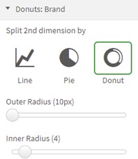
Figure 8: 2nd Dimension Split
Colors and Legend
In the Colors settings (Figure 9), you can set the colors in the line chart by using a Color Scheme or entering a list of HEX color codes. You can also choose to Reverse Colors or use Consistent Colors.

Figure 9: Colors
You can also customize Null Value Colors (Figure 10), setting the Null Value Color.
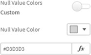
Figure 10: Null Value Colors
If you choose to Show a Legend (Figure 11), you can choose the Legend Position, Align the legend, set the Legend Font Color and Font Size, and set a Char Limit.
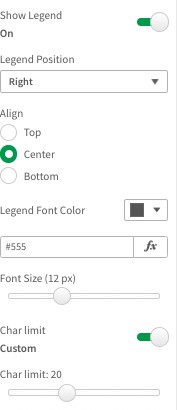
Figure 11: Legend
Scroll Preview
In the Scroll Preview settings (Figure 12.1 & 12.2), you can customize the Scroll alignment, Scroll position, set the Max. Data points showing scroll and control the Scroll preview size.
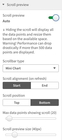
Figure 12.1: Scroll Preview
You can further advance the scroll feature by changing the Scrollbar type to:
-
Mini chart
-
Presents a mini-cart scrollbar which can be interacted with by scrolling and resizing.
-
-
Advanced
-
You can interact by scrolling and resizing.
-
-
Basic
-
You can only interact by scrolling (This is a fixed with determined by the number of bars you want to show by the Set Threshold Limit property).
-

Figure 12.2: Bar Chart example of the Scrolbar options