Properties - Appearance
The Appearance tab manages settings relating to the look and feel of Vizlib Ridgeline Plot.
This topic contains the following sections:
General
In the General tab (Figure 1), you can choose to show or hide a Title, Subtitle and Footnote. You can also Disable Hover Mode and Show or Hide details.
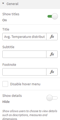
Figure 1: General
Alternate States
Alternate States (Figure 2) permits you to assign your Vizlib Ridgeline Plot to an alternate selection state, which you can then use to perform comparative analysis between sets of multiple data items.
If you want to add the object to master visualizations, choose <inherited state> from State. You can find more information about working with alternate states here.
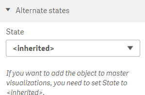
Figure 2: Alternate States
Grid Format
Grid Format (Figure 3) has settings which control a grid on the chart. You can choose a Grid Style, Grid Color, Grid Opacity, Grid Thickness and select whether to Show Horizontal Lines and Show Vertical Lines.
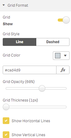
Figure 3: Grid Format
Presentation
The Presentation settings (Figure 4) lets you select a Line Curve Style (Basis, Linear, Natural, Step). You can also enable a Scroll preview to display a minichart, setting the Scroll alignment (the default position is top left of the chart), Scroll position and set a Threshold limit, only displaying the scroll if the data points exceeds the threshold.
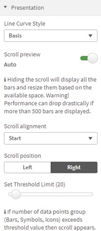
Figure 4: Presentation
X-Axis
Figure 5 shows X-Axis settings, which are enabled with Show. You can activate a Time aware axis, which will display an accurate view of any time-based data, and choose between a range of label formats. You can also choose the axis Position, select a Font Color, a Font Size and apply a Characters limit (Automatic or Custom).
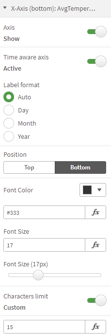
Figure 5: X-Axis
You can select the Dimension Labels Position, apply an Axis Line Color and also set the Line Thickness. If you select Show Axis Title (Figure 6) you can set the Title Font Color, Title Font Size, Title Font Style, and choose Show alternative count to add and display an alternative dimension.
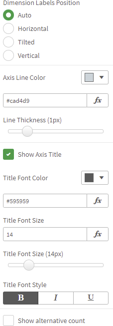
Figure 6: X-Axis Title
Y-Axis
Figure 7 shows Y-Axis settings, which are enabled with Show. You can set the axis Position, choose a Font Color, a Font Size, set the Label Font Size, apply a Characters limit (Automatic or Custom), apply an Axis Line Color and set the Line Thickness.
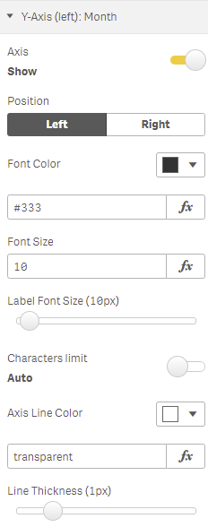
Figure 7: Y Axis
If you select Show Axis Title (Figure 8) you can set the Title Font Color, Title Font Size, Title Font Style, and choose Show alternative count to add and display an alternative dimension.
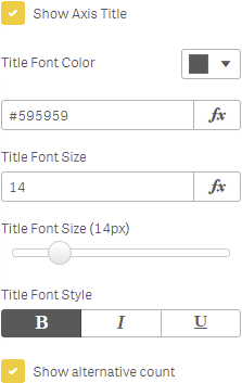
Figure 8: Y Axis Title
Measure
If you select Show Title in the Measure settings (Figure 9) you can set the Title Font Color, Title Font Size, Title Font Style, and choose Show alternative count to add and display an alternative measure.
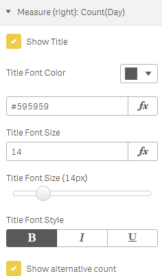
Figure 9: Measure
Colors
In the Colors tab, you can customize your color settings, choosing color by Single Color, Dimension or Measure and selecting a color scheme (Figure 10).
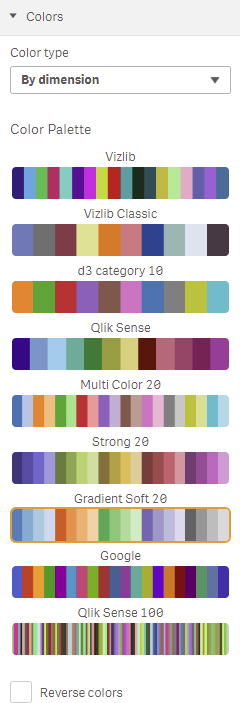
Figure 10: Colors
You can also choose Reverse Colors and switch the allocated color scheme values (e.g. for coloring by measure, colors allocated to low values are re-allocated to high values).
If you want to apply colors By measure, you can enable Use custom measure, then use Select measure to define the measure the chart will display (Figure 11).
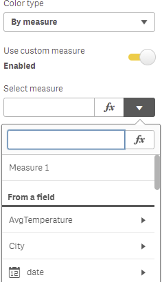
Figure 11: Select Measure