Properties - Appearance
In the Appearance section, you can control and manage the look and feel of your Vizlib Slider objects.
This topic contains the following sections:
General
In the General section (Figure 1), you can add a Title, Subtitle and a Footnote. You can also enable Toggle off hover menu and choose to Show details.
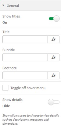

Figure 1: General
Global Styling
In Global Styling (Figure 2), you can set the Border Styling, customize the Global Background and choose to Hide borders on 'sense focus'.
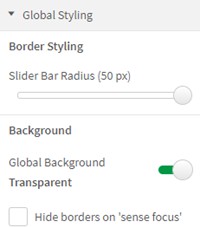
Figure 2: Global Styling
Title
If you enable Show Title, you'll display the Title section (Figure 3), where you can set a Title value and Position. You can also choose the Font Color, Font Size and Font Style.
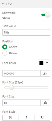
Figure 3: Title
Scale
In the Scale settings (Figure 4), you can set the Scale Position, Font Color, Font Size and Font Style for Min/Max Styling. You can also choose to show a Scale, setting the Scale Position and selecting a Ticks Scale.

Figure 4: Scale Settings
Scale Styling (Figure 5) lets you set Scale Line Color, Scale Line Thickness, and Scale Line Opacity if you select Show Scale Line. You can also set the Font Color, Font Size and Font Style for Scale Ticks.
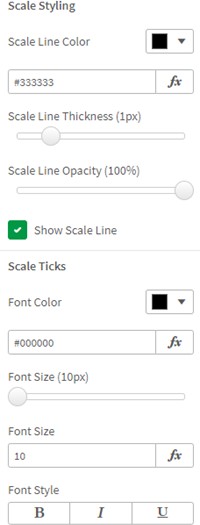
Figure 5: Scale Line, Scale Ticks
Slider Bars
With Slider Bars (Figure 6), you can manage settings for the Selected and Remaining areas of the slider bars. You can set the Bar Color, Bar Height, Bar Border Color, and Bar Border Thickness for both categories.

Figure 6: Slider Bars
Pointer
The Pointer (Figure 7) divides the slider bar into two parts: Selected and Remaining areas. If you switch to Show, you'll display the settings. You can choose a point Type from Square, Circle, Line, Icon and Image, set the Color and select the Pointer Size.
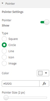
Figure 7: Pointer
You can also set a Border Color, Border Thickness and Show an Icon Background, choosing a Color and setting the Size.
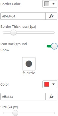
Figure 8: Icon Background
Selected Value
The Selected Value of the pointer (Figure 9) is displayed when you enable Show. You can set the Position and choose to Pin tooltip to pointer.
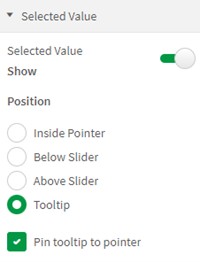
Figure 9: Selected Value
With Text Styling (Figure 10), you can set the Text Color, Font Style, Font Family and customize the Font Size Mode, setting the Font Size.
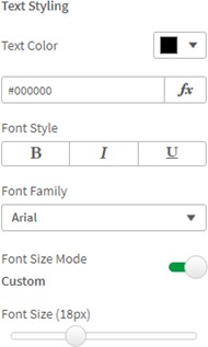
Figure 10: Text Styling
The Tooltip settings (Figure 11) let you choose a Background Color, Border Color and enter a Custom Tooltip message when it's enabled.
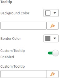
Figure 11: Tooltip