Properties - Switch Items
The Switch Items menu in the property panel controls the settings each for Vizlib Switch object you've added. You can find it in the property panel under the Templates menu (Figure 1).
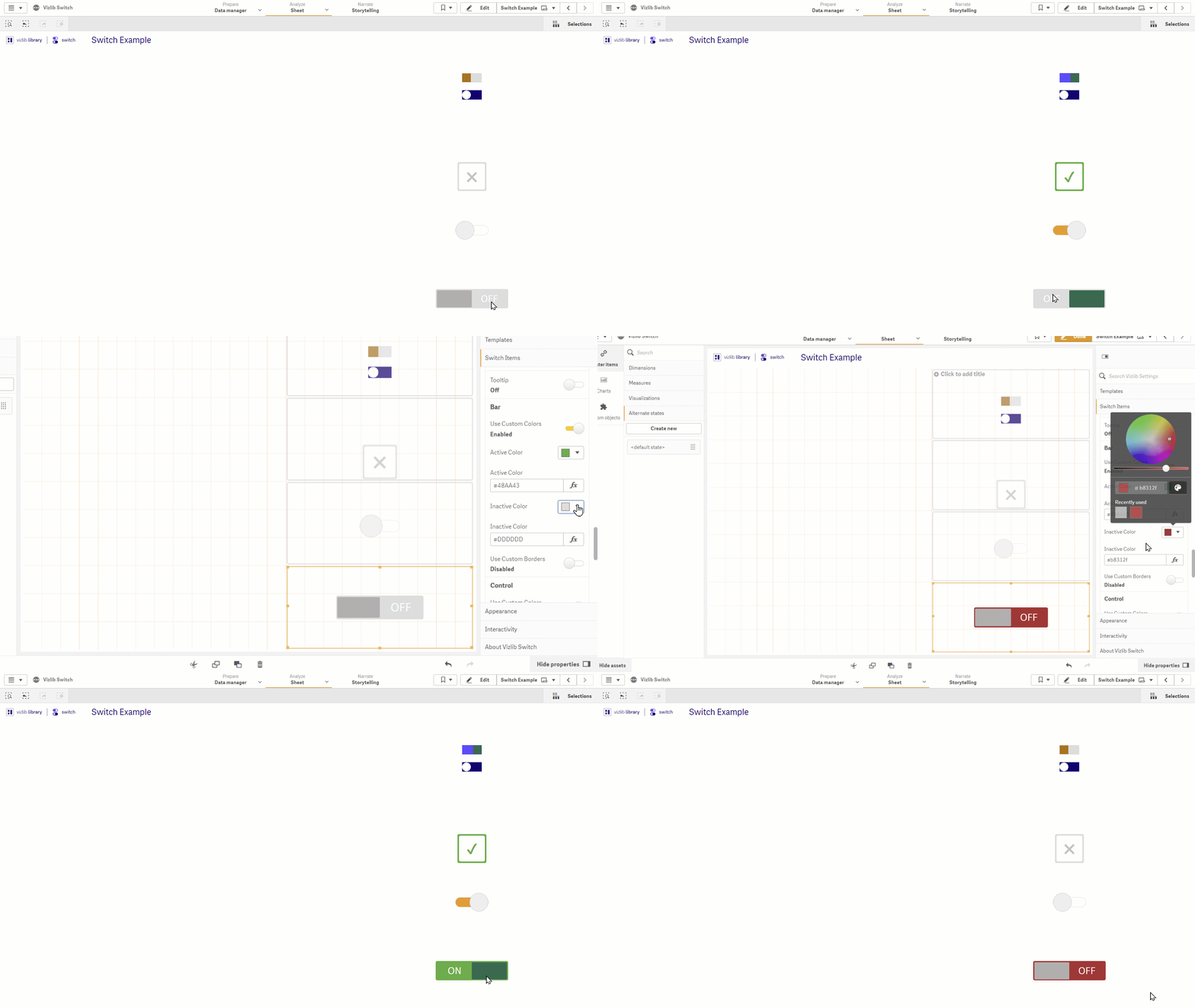
Figure 1: Switch Items
This topic contains the following sections:
Getting Started
Click the arrow next to the item title to open the property settings (Figure 2). You can use the text boxes to edit the Name, Switch Variable (you'll use this to reference the item in Qliksense) and the Active and Inactive value.
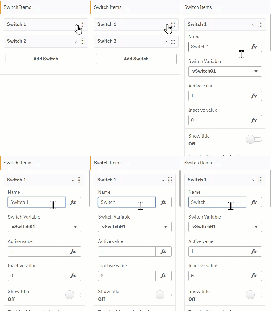
Figure 2: Switch Items
Title Settings
If you want to display a title in your switch item, slide the Show title toggle to On to display the settings (Figure 3). You can set the title Position, Color, Font Style, Font Family, and Font Size.
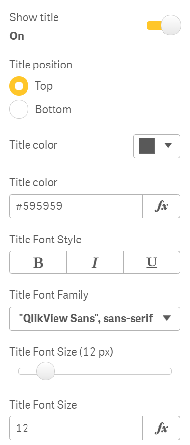
Figure 3: Show Title
Note: Figure 4 shows the difference between switch item settings (label 1, edited in the property panel under Name), and switch object title (2, edited in the sheet).
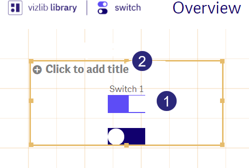
Figure 4: Item Title / Object Title
Control and Bar Settings
There are two elements to a switch item: Bar and Control.
-
The Bar is the frame which contains the switch control.
-
The Control is used to turn the switch on and off.
By default, control and bar settings are hidden in the property panel. If you need to customize any of these settings, slide the toggle to the right to display the menu.
Figure 5 shows the settings available for entering Text inside control or bar. You can enter text for Bar and Control, and for Active and Inactive states (when the switch is enabled/disabled). As the settings are the same for each state, we're showing the menu for Bar Active state.
You can enter Inline text, select the Font color, Font style, Font family and Font size.
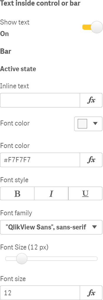
Figure 5: Text Inside Control or Bar
To add Tooltip to the switch item, enable the Tooltip menu and enter the text you need (Figure 6).
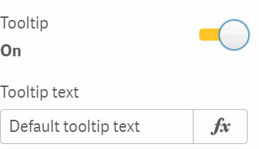
Figure 6: Tooltip
You can also customize colors and borders settings for Bar and Control, with separate controls for an Active and Inactive state. The menus for these settings are displayed by sliding the toggle to the right, and they are the same for both of the elements.
Figure 7 shows the controls for Bar Custom Colors.
You can set the Active Color and the Inactive Color here, which changes the switch item background color for each state.
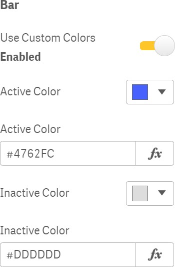
Figure 7: Custom Colors
Figure 8 shows the controls for Control Custom Borders. You can set the Border Radius, Border Size and Color.
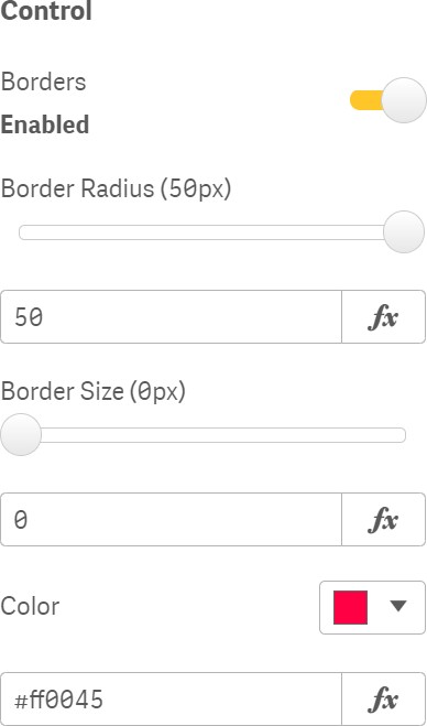
Figure 8: Custom Borders