Properties - Header
Header settings allow you to display a header in your Vizlib Tiles sheet, and then customize the header look and feel. Figure 1 shows a header being added to a sheet, with the header having a gradient color setting applied and a text layer added.a
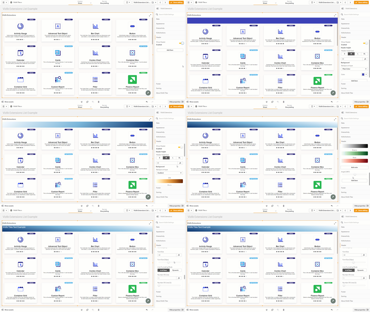
Figure 1: Adding a Header
This topic contains the following sections:
Show Header, Background Type
When you enable Show Header, basic settings are applied as a default. You can choose your Header height, customize the Background type, and add an item with Add Item (see below).
A Plain background (Figure 2) allows you to select a Custom Color.
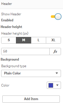
Figure 2: Show Header
Gradient (Figure 3) varies the background shading according to its layered position within the tile, and you can choose from a pre-defined color set or add your own. You can also vary the gradient Angle using the slider.

Figure 3: Gradient
You can use an Image as a background by adding an Image URL (Figure 4).
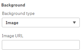
Figure 4: Image
Layer Types
If you click Add Item, you'll be able to add a Layer type to the header and enter a Value (Figure 5). There are four layer types: Text, Image, Line and Icon.
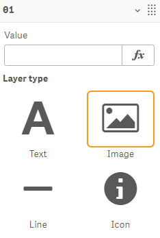
Figure 5: Layer Type
Note: A gauge has been introduced for settings using an expression editor (Figure 6) with two options: Green or Red.
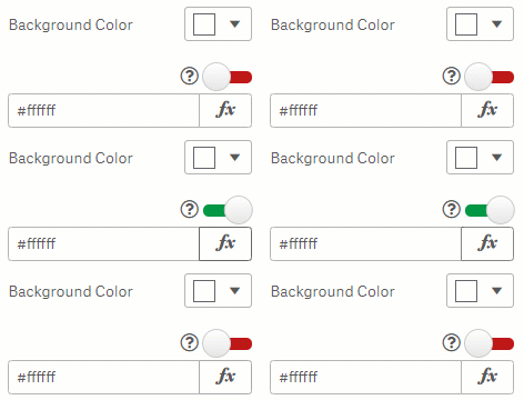
Figure 6: Calculation Gauge
-
Green - evaluates the expression once for the entire extension.
-
Red - evaluates the expression once per tile. This setting only can negatively impact performance.
Text
Text layers (Figure 7) display text, and you can enable an Indicators setting which lets you display icons which rank the element values against a Threshold. There are three icons to choose from: Greater Than, Less Than and Equal to. You can choose the Icon symbol and Icon Color, as well as set the Icon Position and the Space between icon and text. Horizontal Alignment (left, centre or right) and Vertical Align (Top, Middle or Bottom) let you set the element position within the cell. You can set a level of Text Padding around the title label, and choose a Font Color, Font Family, Font Style, Font Unit Type and Font Size. There is also a setting to choose the Line Truncating Mode.
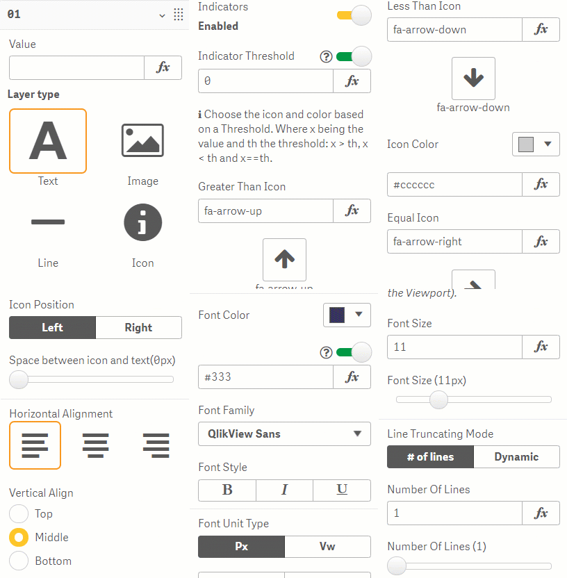
Figure 7: Text Layer
Image
Image layers (Figure 8) display an image, and can be customized using Stretch Image settings and the Image Alignment.
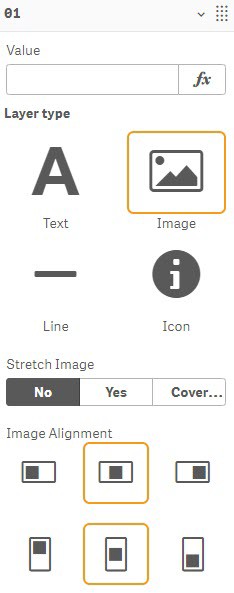
Figure 8: Image Layer
Line
Line layers (Figure 9) display a line, and you can customize settings controlling the line orientation, select the Line Color, Line Size, Line Style, the Corners Radius, Margin Size, vary the line visibility with Line Opacity, and set the Vertical Align.
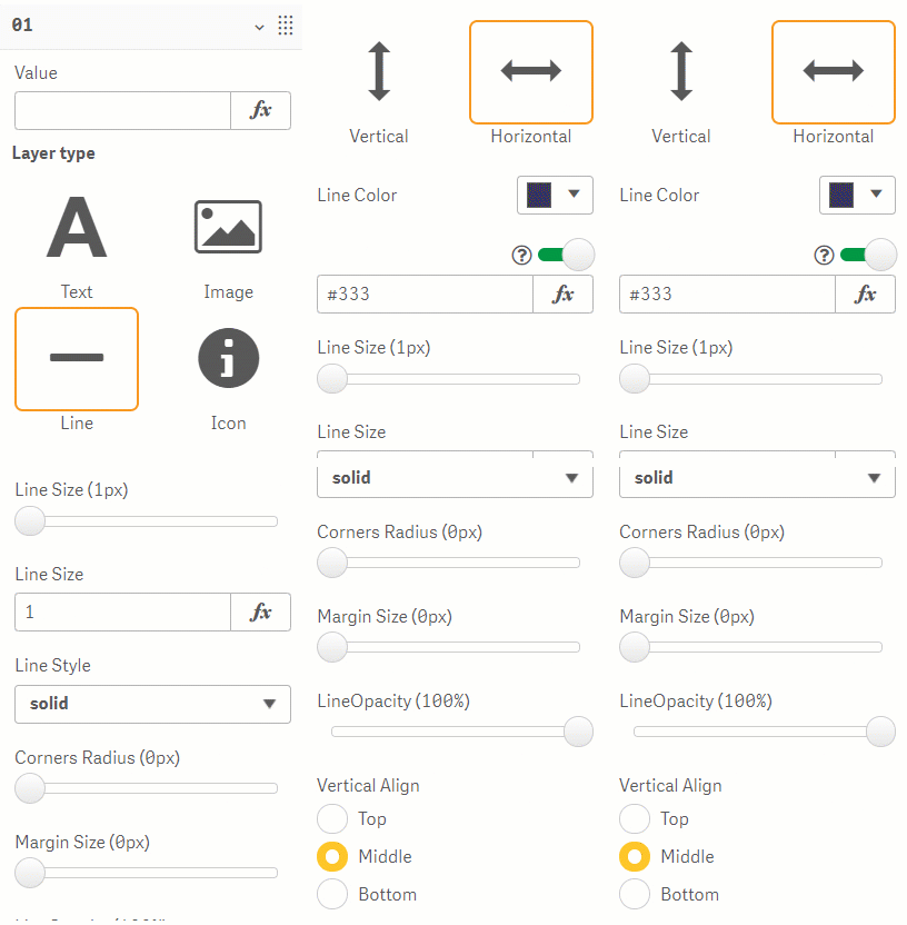
Figure 9: Line Layer
Icon
Icon layers (Figure 10) display an icon, with settings to select the Icon, the Icon Color, the Font Unit Type, and the Font Size. Horizontal Alignment (left, centre or right) and Vertical Align (Top, Middle or Bottom) let you set the element position within the cell.
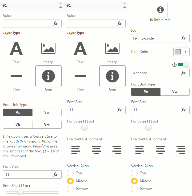
Figure 10: Icon
Background Color
Background Color settings can be applied to all layer types (Figure 11). You can select the background Type, the Background Color, and select a level of Background Color Opacity.
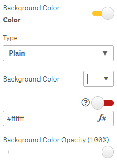
Figure 11: Background Color
Layer Border
The Layer Border settings can be applied to all layer types (Figure 12), you can choose your borders using the boxes in the Border Selector, the Border Style, Layer Border Color, Layer Border Width, Layer Corner Radius, and the Layer Corner Radius.
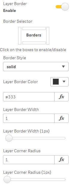
Figure 12: Layer Border
Enable Tooltip
The settings to Enable Tooltip can be applied to all layer types (Figure 13) and contains settings to enter Tooltip Text, set the Background Color, the Font Size, Font Family, Font Style, Font Color and the Tooltip Position.
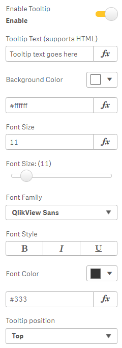
Figure 13: Enable Tooltip
Position, Size
You can choose between two modes to set the layer Position and Size.
-
Dynamic - size and position stay proportionate to the tile size e.g. if the tile width increases, the layer width also increases.
-
Static - size and position are fixed, and do not change if the tile is re-sized (Figure 14) e.g. an object placed in a particular corner will keep that position.
You can also set the Layer opacity using the slider.
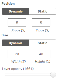
Figure 14: Position, Size
Actions
The Actions settings allow you to add Vizlib Actions (Figure 15) by clicking Add Action, selecting an option from Pick Action and entering a Field or Field Value. For more information on using Vizlib Actions please click here.
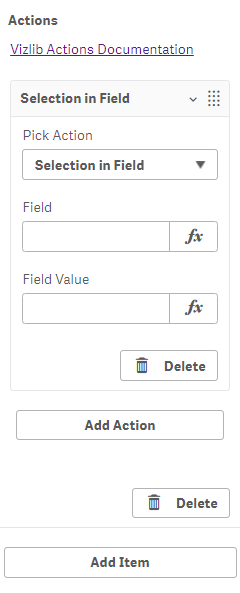
Figure 15: Actions