Properties - Custom Styling & Conditional Formatting
If you'd like to apply your own styling to your data, Vizlib Writeback Table contains Custom Styling settings in the property panel, with functions to help modify and control presentation and color branding. Conditional formatting is a powerful way to change the styling of the table on values in the table.
Vizlib Writeback Table now uses the Color Picker to apply color settings, you can read full instructions here.
Note: When you click a column in the writeback table in edit mode, you'll open the column properties in the property panel.
This topic contains the following sections:
Custom Styling
Figure 1 shows changes being made to the Checkbox column. The column name is edited, custom tooltip is added, the checkbox border color and header column header background color are customized and the alignment of the column is changed from center to left.
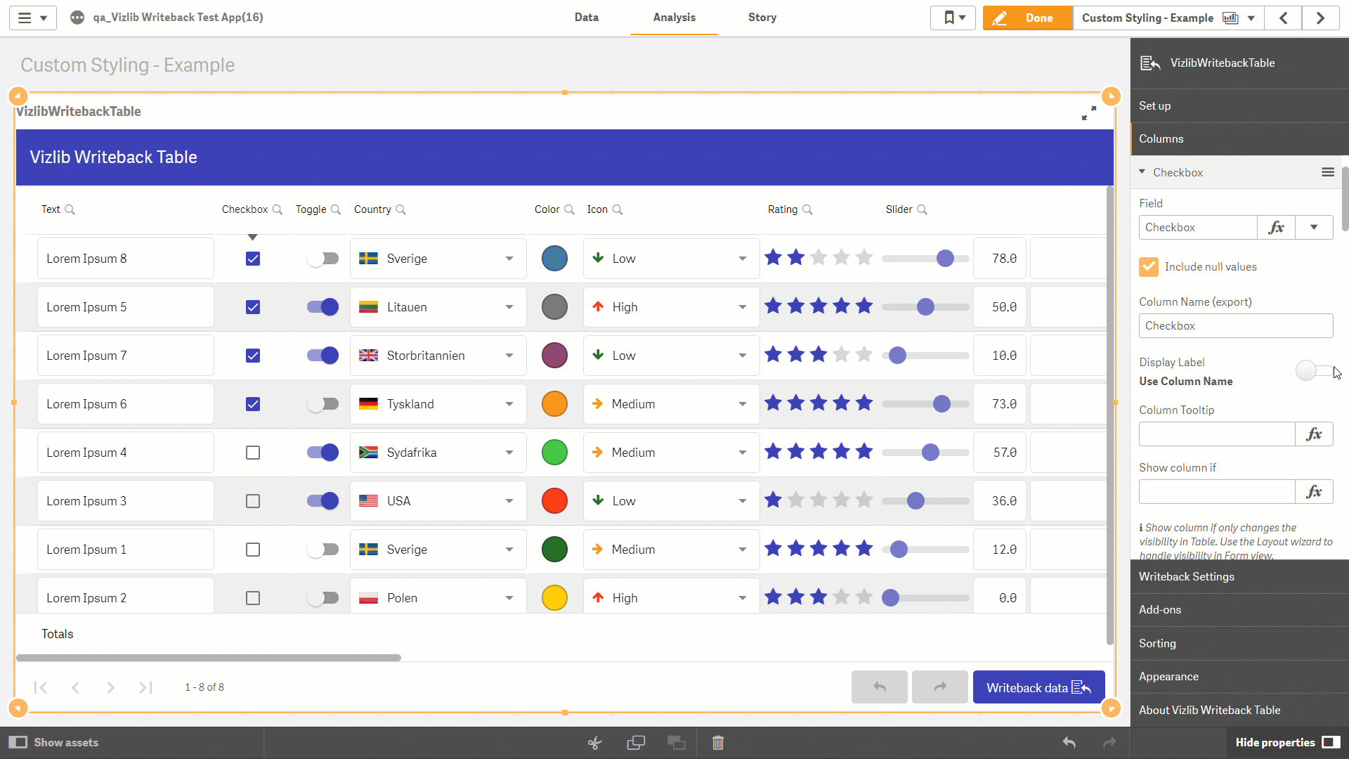
Figure 1: Custom Styling Example
Custom Theme
To start using custom styling, toggle the Custom Theme slider to the right to allow you to edit the Custom properties (Figure 2). This example shows the properties for a Checkbox data type.
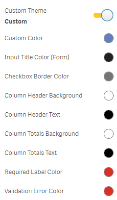
Figure 2: Custom Theme
There are two ways you can select a color in Custom Styling. You can open the color palette and select a color using the slider or the matrix, or enter the color hex code in the expression editor e.g. entering #000000 will set the color to black.
The color settings you can select and adapt for custom styling are listed here:
-
Custom Color - used for table components such as highlights and inputs (e.g. when a checkbox field is selected).
-
Input Title Color (Form) - used for input titles in Form View (visible when Form View is enabled).
-
Checkbox Border Color - used for the border of a checkbox (multiple choice and radio button data types also have this setting).
-
Column Header Background - used for the background in the column header.
-
Column Header Text - used for text in the column header.
-
Column Totals Background - used for the background of column totals.
-
Column Totals Text - used for text in the column totals.
-
Required Label Color - used for the label text in a column where an input is required.
-
Validation Error Color - used for the error message in a column using validation.
Adjust Column Width
You can set your own column width by enabling the Adjust Column Width settings and using the slider or entering a number in the expression editor to change the column width (Figure 3). You can also choose how to Align Input in a column by selecting Center, Left or Right from the drop-down.
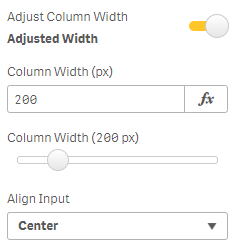
Figure 3: Adjust Column Width
Adjust Image Height
If you choose to display an image rather than text, you'll be able to manage the image display with the Adjust Image Height settings (Figure 4). You can set the Column Image Height using an expression or the slider, choose options for the Size, the Vertical Alignment and Horizontal Alignment.
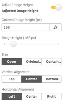
Figure 4: Adjust Image Height
Custom Column Tooltip
If you'd like to apply changes to the tooltip in a table column, you can enable the Custom Column Tooltip settings (Figure 5) for a column and choose a Column Tooltip Icon and Column Tooltip Icon Color.
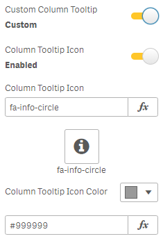
Figure 5: Custom Tooltip
Copy and Paste Column Styles
In Vizlib Writeback Table, you can copy and paste column styles which reduces the time you spend on adjusting the table formatting to the desired look and feel. You can copy and paste styles using the Copy styles and Paste styles options available in the Property Panel > Columns > [Column Name] > Other Settings.
Figure 1: Copy and paste styles options in the Property Panel
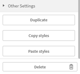
Alternatively, you can right-click on the column header on the dashboard and select the Column styles > Copy column styles or Paste column styles options.
Conditional Formatting Overview
Conditional formatting allows rows or individual cells to be formatted using expression. Figure 6 shows an example of changing the color of the row from green to red depending on the slider value.
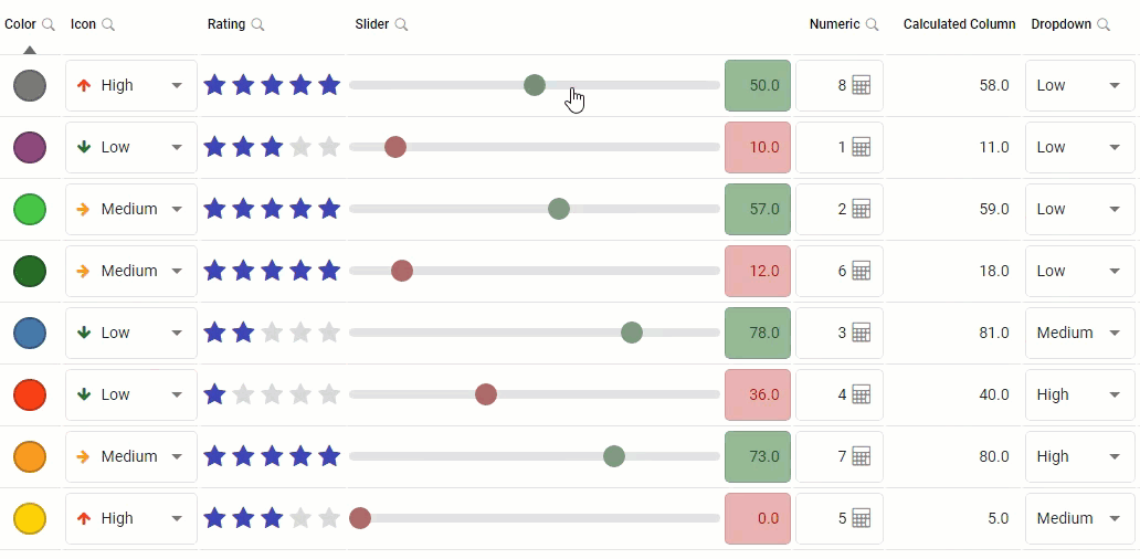
Figure 6: Conditional formatting slider column
Row Conditional Formatting
To enable conditional formatting on rows navigate to the Appearance section in the property panel and the Conditional formatting section.
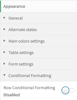
Figure 7: Row Conditional Formatting setting
When Row Conditional Formatting is enabled you can add rules with the Add Rule button (Figure 8). If multiple rules are added the rules are prioritized from the top to bottom, e.g. if the conditions of 2 rules are valid and use the same format property the first rule in the lists format will apply.
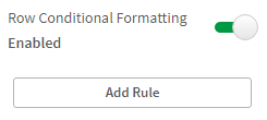
Figure 8: Add rule button
Select the column you want to drive the rule and set the operator and value to complete the rule.
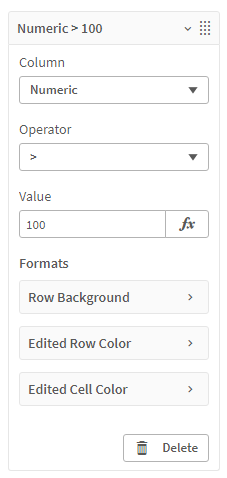
Figure 9: Rule
The operator determines the condition in combination with the value. E.g. Figure 9 shows a rule where conditional formatting is applied when the value in the Numeric column is greater than 100.
Operators for:
-
All column types
-
= Equal
-
≠ Not equal
-
-
Numeric column types
-
> Greater than
-
< Less than
-
≤ Less than or equal
-
≥ Greater than or equal
-
-
Text column types
-
Contains
-
Starts with
-
Ends with
-
-
Chips and Multiple Choice column types
-
Includes (with the possibility to define many values)
-
-
Date column types
-
= Equal
-
≠ Not equal
-
> Greater than
-
< Less than
-
≤ Less than or equal
-
≥ Greater than or equal
-
The Contains, Starts with and Ends with operators aren't case sensitive.
Row Conditional Formatting can format:
-
Row Background
-
Edited Row Color
-
Edited Cell Color
Note: A check mark icon is displayed before the format if the format is configured in the rule.
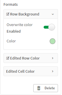
Figure 10: Formats
Cell Conditional Formatting
To enable conditional formatting on cells navigate to the Conditional formatting section in the property panel on the Column you want to apply conditional formatting on. Figure 11 shows the Slider column setting when it's disabled.
Figure 11: Cell Conditional Formatting
When Conditional Formatting is enabled for a column you can add rules with the Add Rule button (Figure 12). If multiple rules are added the rules are prioritized from the top to bottom, e.g. if the conditions of 2 rules are valid and use the same format property the first rule in the lists format will
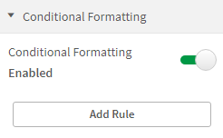
Figure 12: Cell Conditional Formatting enabled
Cell conditional formatting rule always references the value of the column where the rule is enabled. Set the operator and value to complete the rule.
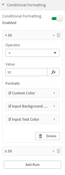
Figure 13: Cell Conditional Formatting rule
Cell Conditional Formatting can format:
-
Custom Color
-
Input Background Color
-
Input Text Color
Note: A check mark icon is displayed before the format if the format is configured in the rule.