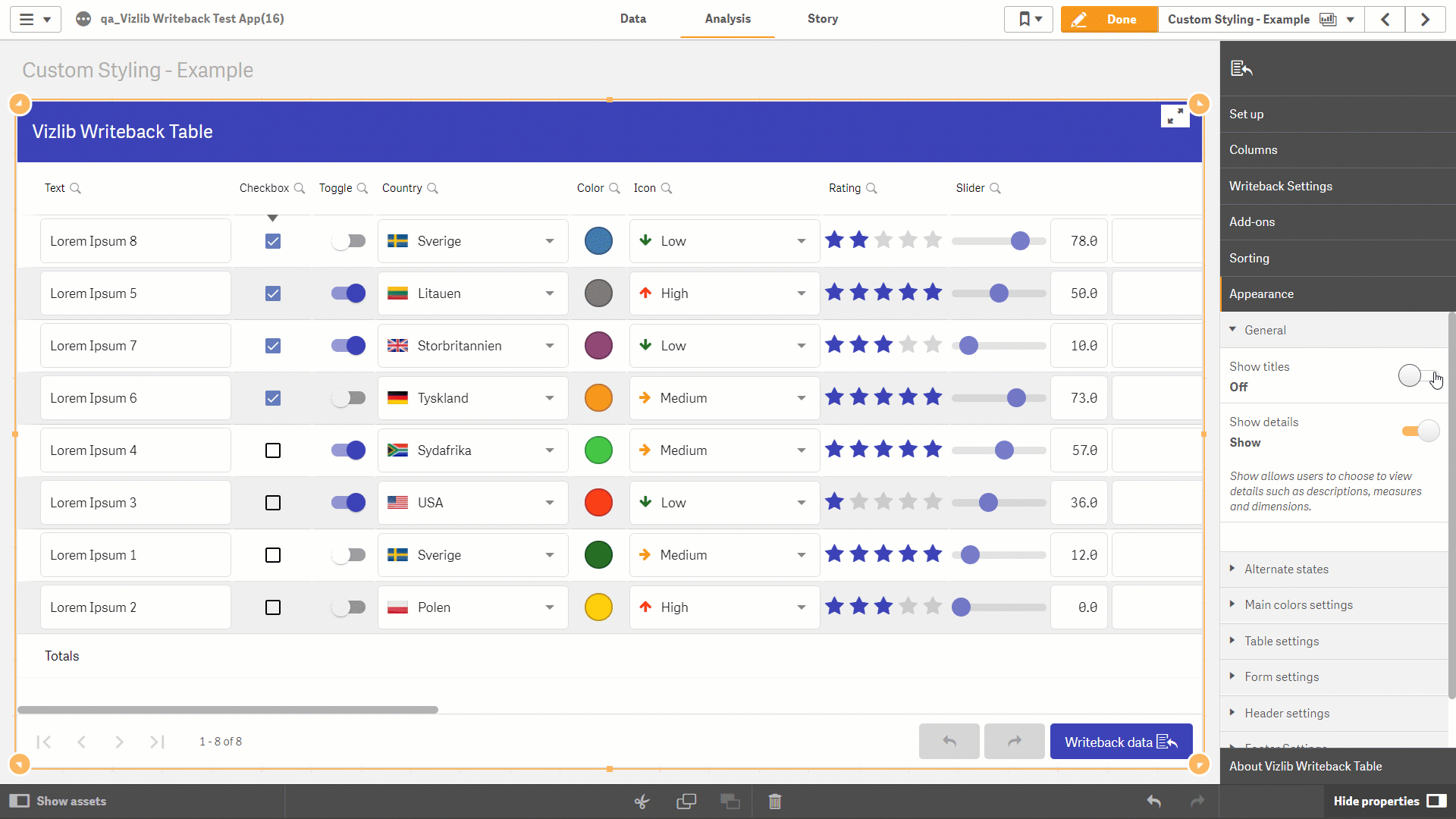
Properties - Appearance
The Appearance section contains settings which can be used to alter the look and feel in Vizlib Writeback Table (Figure 1). You'll use the Color Picker to apply color settings, you can read full instructions here.
Figure 1 shows a title being added, the Main Color changed to green, the Input Background Color changed to yellow, the Odd Rows Color changed to orange, a Background Gradient applied to the Header and the Disabled Color changed to purple in the Footer.
Figure 1: Example
This topic contains the following sections:
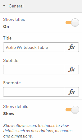
General
With the General settings, you can enable Show Titles to display a Title, Subtitle, and Footnote, and Show Details to display descriptions or data related to any dimensions or measures you're using (Figure 2).
Figure 2: General
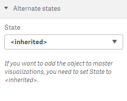
Alternate States
With Alternate States, you can assign your visualization to an alternate selection state, where you can perform comparative analysis between sets of multiple data items (Figure 3). If you want to add the object to master visualizations, you need to set State to Inherited. You can find more about alternate states here.
Figure 3: Alternate States
Main Colors Settings
Main colors settings (Figure 4) allow you to customize the colors you use in the visualization. You can choose the color you want by clicking on the color palette or entering your own hex color code in the expression text box (e.g. #FFFFFF is white).
Figure 4: Main Colors Settings
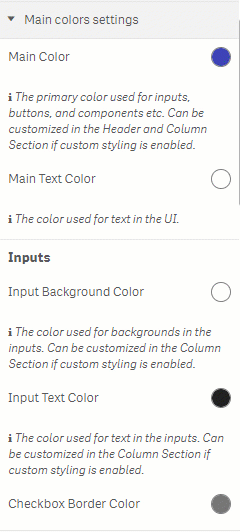
The Main Color and Main Text Color set the background and text color for components like buttons and selections (e.g. ticking a check box). Inputs settings allow you to select colors for entering information in the table. You can customize the Input Background Color, Input Text Color, Checkbox Border Color, Inline Text Color, the Chips Background Color, Chips Text Color (for the chips data type), and the Evaluated Label Color. With Other settings, you can choose the Required Label Color (if a field requires a value to be entered) and a Validation Error Color if a validation error is returned.
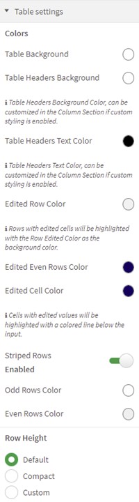
Table Settings
Table settings (Figure 5) control the colors used in the table section of the visualization. You can set the color for the Table Background, Table Headers Background, Table Headers Text Color, Edited Row Color, and Edited Cell Color. You can enable the Striped Rows settings to choose an Odd Rows Color, an Even Rows Color and set the Row Height.
Figure 5: Table Settings
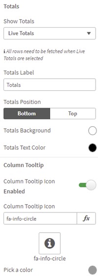
If you choose to show Totals in the table, you can select a function to Show Totals - None, Live Totals (which instantly display updated values, and can be used for all column types) and Measure Totals (which will only display updated values when a writeback operation completes). There are settings to define a Totals Label, Totals Position, Totals Background, and Totals Text Color. You can also choose to enable a Column Tooltip Icon, and customize the Custom Tooltip Icon Color.
Figure 6: Totals
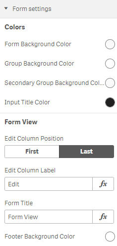
Form Settings
Form settings (Figure 7) control the colors displayed when Form View is enabled. You can choose the Form Background Color, the Group Background Color, and the Input Title Color. Form View settings let you select an Edit Column Position, and Edit Column Label, Form Title, and Footer Background Color.
Figure 7: Form Settings
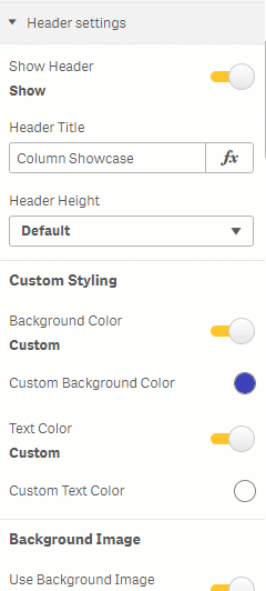
Header Settings
If you choose to enable Show Header, you can use Header Settings (Figure 8) to customize the Header Title, and select the Header Height. In Custom Styling, you can enable Custom settings for the Background Color and Text Color. You can add a Background Image and set the image Size, Vertical Alignment and Horizontal Alignment, and use a Background Gradient (a gradual shading along the header), setting a Start Color, Start Opacity, End Color, End Opacity and Angle.
Figure 8: Header Settings
If you choose Use Image, you can enter the Image URL, set the image Vertical Alignment, Horizontal Alignment, Image Height and Image Width. You can also set a Font Size, Vertical Alignment, Horizontal Alignment for your header Title, and enter a Subtitle, customizing the Horizontal Alignment and the Font Size.
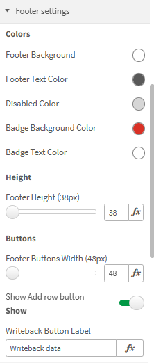
Footer Settings
You can use Footer Settings (Figure 9) to customize the Footer Background, Footer Text Color, and the Disabled Color. You can also customize a Writeback Button Label in the Buttons section. Additionally, you can adjust Footer Height and Footer Buttons Width.
Figure 9: Footer Settings
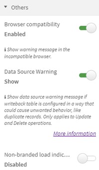
Others
In Others settings (Figure 10), you can choose to display a warning message about Browser compatibility, display a Data Source Warning, and enable the Non-branded load indicator setting if you'd like to hide the Vizlib logo when you perform a reload operation.
Figure 10: Others