Dimensions
This topic explains the properties within the Dimension section of the Vizlib Gantt's property panel. This section has options for controlling the Event and Group properties, such as dependencies, progress, styling, etc.
Note: No measures are required to create the Vizlib Gantt.
Please see Vizlib Gantt - Dependencies / Critical Flow for details on how to set up your dataset with the additional fields of ORDER and PREDECESSORS to create your critical flow.
This topic contains the following sections:
Dimensions
Overview
The Dimensions of the Vizlib Gantt determine the Event and Groups. The Layout of the Dimensions is explained in Figure 1.
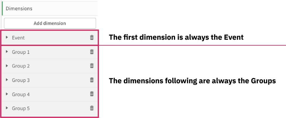
Figure 1: Dimension example layout
Vizlib Gantt has no cap on the number of dimension groups it can support; however, keeping the number lower than 10 is recommended, as more dimensions can result in lower performance.
Adding Dimensions
It is not required to use the Setup Wizard as properties can be edited within the property panel; however, the Setup Wizard provides a more simple and visual approach to creating the Vizlib Gantt chart.
In the Setup Wizard, you can add up to four dimensions; one Event dimension and three Group Dimensions. Additional Dimensions are added in the Property Panel > Dimensions, then click Add dimension (Figure 2).
Note: To use dependencies/critical flows within your Vizlib Gantt, read Vizlib Gantt - Dependencies / Critical Flow.

Figure 2: Add more Dimensions in the property panel
Event
Event Data
The first dimension is the Event dimension. This dimension has editing options that control items like progress, dependencies, and Tooltips.
The starting segment is where you define the Event Field (Figure 3). The Label can be changed for easier identification within the property panel.
By default, Include null values is checked, you can uncheck this to remove null values from your Gantt.
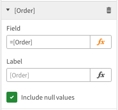
Figure 3: First segment controlling defining the Event Field
Figure 4.1 allows you to change the Event name. You have to use a field within your data model if you want the name to be dynamic, or, you can use the equals sign and two (2) straight apostrophes along with text (example, ='<string>') to define a static name for your Events.
The same applies to the Event tag field, where you can have a dynamic or static name to define a tag for your Event fields. An example is illustrated in Figures 4.2 and 4.3. Tags can be outside or inside the event, controlled in Appearance > Event Bar Styling > Event tag position.
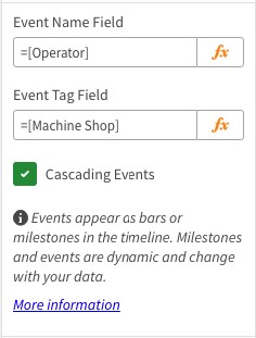
Figure 4.1: Additional Event name properties
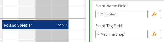
Figure 4.2: Dynamic fields
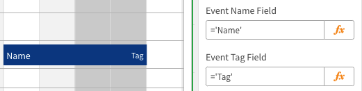
Figure 4.3: Static fields
The option Cascading events defines whether the Events can be on the same row. The outcome of whether the option is true or false is seen in Figure 4.4. Cascading events take up more vertical space requiring more scrolling.

Figure 4.4: Cascading events
Event Dates
The events of the Vizlib Gantt are defined by a Start date and End date or Duration.
-
Figure 5.1 defines the Start date as a date (i.e. 01/01/1990) and an End date as a date (i.e. 01/01/2000). The date format must be the same as is defined in the Data load editor unless specific within an expression with a Date Expression (i.e. Date('2000/01/05', 'YYYY/MM/DD')).
-
Figure 5.2 defines the Start date and Duration as the number of days the Event takes to complete (i.e. 5). Duration can be an integer (whole number) or float (decimal number).
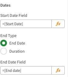
Figure 5.1: Start date - End date
Figure 5.2: Start date - Duration
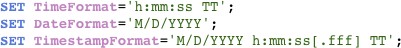
Figure 5.3: Data load editor date and time format
If an event does not have an End date/Duration, then the Event becomes a modified milestone (Pin milestones) with a pin in the centre of the event, which places itself on the timeline axis of the Gantt, indicating when the Event's Start date is (Figure 5.4).
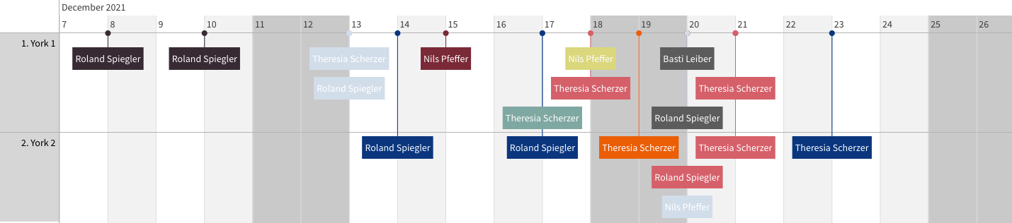
Figure 5.4: Event pin milestones
Event Color Settings
The Color setting for Events (and Auto identified milestones*) is controlled here. Toggling off the switch from Global to Custom (Figures 6.1 & 6.2) leads to two (2) outcomes:
-
Global: The Appearance > Event Bar Styling > Colors are applied.
-
Custom: This means the inputted color will override the Appearance color settings.
Note: For Custom events and milestones, the color setting is not edited within this section; but within Custom Event Objects. For more information, see Vizlib Gantt - Custom Events & Custom Milestones.
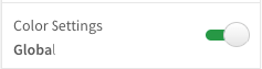
Figure 6.1: Color setting to Global
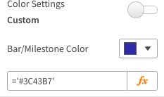
Figure 6.2: Color setting to Custom
Note: * The Auto identified milestone's color is controlled in two ways.
Global: The Auto identified milestone's color is defined by Appearance > Milestone Styling.
Custom: The custom color in the Event dimension controls color output.
Event Font Color Settings
The Font color setting for Events is controlled here (auto identified milestones aren't controlled with this feature). Toggling off the switch from Global to Custom (Figures 7.1 & 7.2) leads to two (2) outcomes:
-
Global: The Appearance > Event Bar Styling > Event bar label color is applied.
-
Custom: This means the inputted font color will override the Appearance color settings.
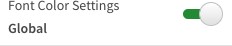
Figure 7.1: Color setting to Global
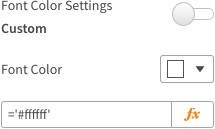
Figure 7.2: Color setting to Custom
Event and Auto Milestone Tooltips
Vizlib Tooltips present more information that is hidden from view until the user, in the case of the Vizlib Gantt, hovers over an event or milestone. Watch Video 1, where you learn information on creating Vizlib Tooltips, or read the documentation here. More learning resources can be found here:
-
Data Storytelling with Vizlib Tooltips (YouTube)
-
Data Storytelling with Vizlib Tooltips Demo App (Vizlib.com)
Note: Tooltips can also be applied to Custom events and milestones, but this has to be completed in the Custom Event Objects > Custom Event/Custom Milestone sections.
By default, the Tooltip switch is Auto (Figure 8.1). The Vizlib Gantt applies the Title, Tag (if any), Progress (if any), Start date, and End date (if any) to the Tooltip.
The date configuration cannot be changed and is presented as DateName MonthName DateNumber Year (i.e. Monday August 7 2023).
When the Tooltip switch is toggled to Custom, the options presented are all for further control of the Tooltip. The Custom Tooltip (Supports HTML) can either only apply expressions or HTML code (which supports expressions).
Further learning can be done below.
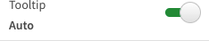
Figure 8.1: Auto tooltips
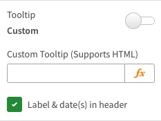
Figure 8:2 Custom tooltips with support for HTML
Three different configurations can be had with the Vizlib Gantt's Tooltip; they are:
-
Auto: (Figure 8.3) The Tooltip switch is set to Auto.
-
Custom Tooltip and Labels & date(s) in header = On: (Figure 8.4) Shows the Auto Tooltip and Custom Tooltip.
-
Custom Tooltip and Labels & date(s) in header = Off: (Figure 8.5) Only showing the Custom Tooltip.
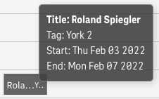
Figure 8.3: Auto tooltips
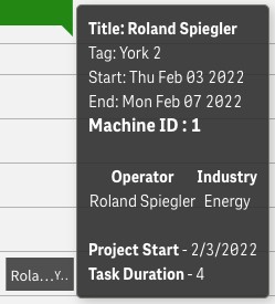
Figure 8.4: HTML tooltip example with Label & date(s) in header On
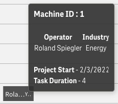
Figure 8.4: HTML tooltip example with Label & date(s) in header Off
Watch for further information on creating Vizlib Gantt Tooltips:
Video 1: Vizlib Gantt tooltips
Event Bars and Milestones
Dynamic Event/Milestone
By default, the switch Dynamic events/milestones are Disabled (Figure 9.1) but can be toggled to Enabled in the Property Panel or in the Vizlib Gantt's Setup Wizard (Milestone).
When Enabled, this shows the secondary switch Milestone identification seen in Figure 9.2 (explained in the next section, Milestone identification). When set to Auto, it defines whether an event is presented as an event or milestone based on the start-end dates. As seen in Figure 9.3, where events and milestones are data-driven.
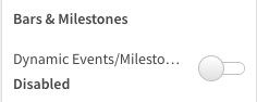
Figure 9.1: Default switch state = Disabled
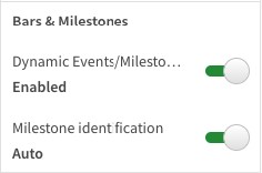
Figure 9.2: Switch state = Enabled
Figure 9.3: Milestone identification = Auto
Milestone Identification
When Milestone identification is set to Auto, this results in Figure 9.3, which is based on if the start end date of the event has the same start and end date (i.e. event start = 2022/01/01 & event end = 2022/01/01) or if Duration = 0, this will be automatically converted to a data-driven milestone.
You can set this up whilst creating the Vizlib Gantt using the Setup Wizard, or you can go to the Vizlib Gantt's Property Panel and toggle the option for Milestone Identification to be Auto (Figure 9.2).
If the data model you use with the Vizlib Gantt has information on whether an Event type is an event or milestone, then this can be used instead of the Vizlib Gantt automatically defining the Event type. Toggling the switch to Custom shows the input field Event type (Figure 10.1). This can then be populated with either a:
-
Field name: (Figure 10.2) A field in your data model which contains information if the Event type is an Event or Milestone.
-
Static definition: As seen in Figures 10.3 and 10.4, the Event type is defined as an Event or Milestone.*
-
Expression: Using an expression to determine when the Event type is an Event or Milestone.**
Note: Your Event type must be written in lowercase letters like so: event & milestone.
* Static definition: Is it important to use an equals sign ( = ) and two (2) apostrophes ( ' ' ) to surround the Event type); see below:
-
='event'
-
='milestone'
** Expression: Expressions can be used to define if the Event type is an event or milestone. for example:
-
=if( field = True() , 'event' , 'milestone' )
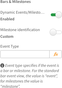
Figure 10.1: Milestone identification = Custom
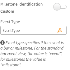
Figure 10.2: Example Event type field
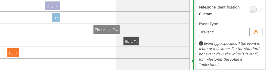
Figure 10.3: Event type = event
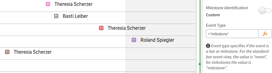
Figure 10.4: Event type = milestone
Dependencies
Please read Vizlib Gantt - Dependencies / Critical Flow for a comprehensive understanding of this feature.
Event Bar Progress
Event bar progress (Figure 11.1) defines how much of the event remains until completion. This is useful for understanding the overall progress of your project. Milestones have no progress value.
The progress is calculated in two (2) ways:
-
Default: (Figure 11.2) Where the number represented the calculated percentage completed. As an example;
-
0.5 = 0.5%
-
50 = 50%
-
100 = 100%
-
-
Alternative: (Figure 11.3) Where the number is timed (x) by 100 to calculate the percentage completed. As an example;
-
0.05 = 0.5%
-
0.5 = 50%
-
1 = 100%
-
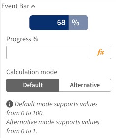
Figure 11.1: Event bar progress
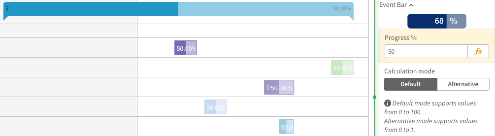
Figure 11.2: Default progress calculation
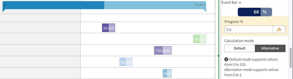
Figure 11.3: Alternative progress calculation
By default, the event and header display the percentage completion of the overall group (Figure 11.4). The event can be displayed with either the event shown (default) or hidden (Figure 11.5). To hide the progress, navigate to Appearance > Event Bar Styling > Show Progress value in the event.
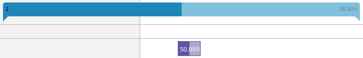
Figure 11.4: Both event and header have a percentage value
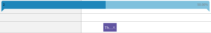
Figure 11.5: Only the header has a percentage value
Note: The header progress value is calculated by averaging the progress values of the events within its group. For example, 20 + 50 + 75 + 100 / 4 = 61.25%.
Milestone
This section, Figure 12.1, controls how milestones are presented. This does not include styling options for Custom milestones. After completing the Setup Wizard, this section is preconfigured, as seen in Figure 12.1.
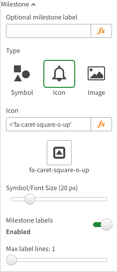
Figure 12.1: Milestone configuration after the Setup Wizard
The milestone name can be changed with the setting Optional milestone label (Figure 12.2). This can be defined in the Setup Wizard.
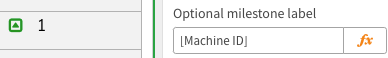
Figure 12.2: Milestone renaming.
The style of the milestones is altered under Type (Figure 12.3) and has an immediate effect on the view of your Vizlib Gantt (Figure 12.4).
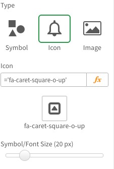
Figure 12.3: Milestone styling
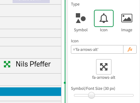
Figure 12.4: Milestone styling result after change
You can control the milestone's appearance in three (3) ways. The options here are:
-
Symbol: (Figure 12.5) Choose between a Circle or Diamond.
-
Icon: (Figure 12.6) The Vizlib Gantt uses Font Awesome version 4 and offers 730 different icons.
-
Image: (Figure 12.7) Using a URL to show an image as the milestone.
Important: The larger the image's file size, the longer the load time.
Note: You can either use URLs as Static, Expressions (i.e. if()), or Data model.
If you are using the URLs within your data model and using them as a field within your expression, it needs to follow this format:
Wrap everything in equals sign ( = ) and two (2) apostrophes ( ' ' ); then, inside the apostrophes, wrap the field name in two (2) apostrophes ( ' ' ) and two (2) ampersands ( & & ); then insert the field between the ampersands; the result will look like this =''&URL&''.
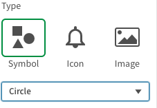
Figure 12.5: Symbol
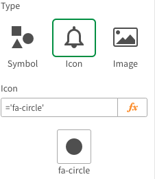
Figure 12.6: Icon
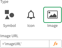
Figure 12.7: Image
Groups
Overview
Groups, also called hierarchies, are defined with every dimension added after the first Event dimension. As seen in Figure 13, Machine Shop, Machine ID, Industry Type, and Operator make up a four dimension group Vizlib Gantt chart.
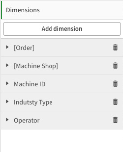
Figure 13: Example of Dimensions with many dimension groups.
First Group
The first dimension group is represented as the second dimension in the Dimensions section. As seen in Figure 14.1, the first group is Machine Shop.
In the first group, there is the option to change the Label name and Include null values, which is controlled via a check box.
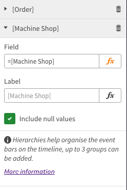
Figure 14.1: First grouping dimension
The first group (second dimension) has no parent header (Figure 14.2). Therefore, styling in Appearance > Group Header Styling will not affect this dimension group.
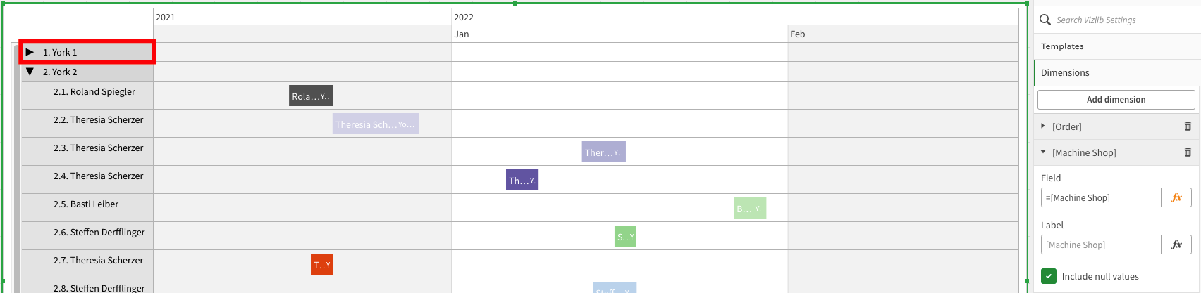
Figure 14.2: Groups collapsed and expanded
Header Groups
Every dimension added after the second dimension (Figure 15.1) will be defined as a group with a header bar. All header groups will have the same options.
Like the first group, there is the option to change the Label name and Include null values, which is controlled via a check box.
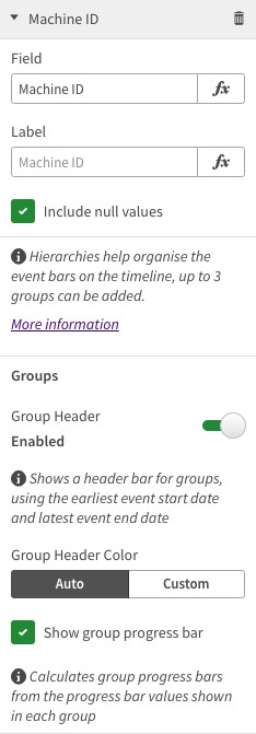
Figure 15.1: First dimension as a header group dimension
The example seen in Figure 15.2 shows an example of one (1) header group.
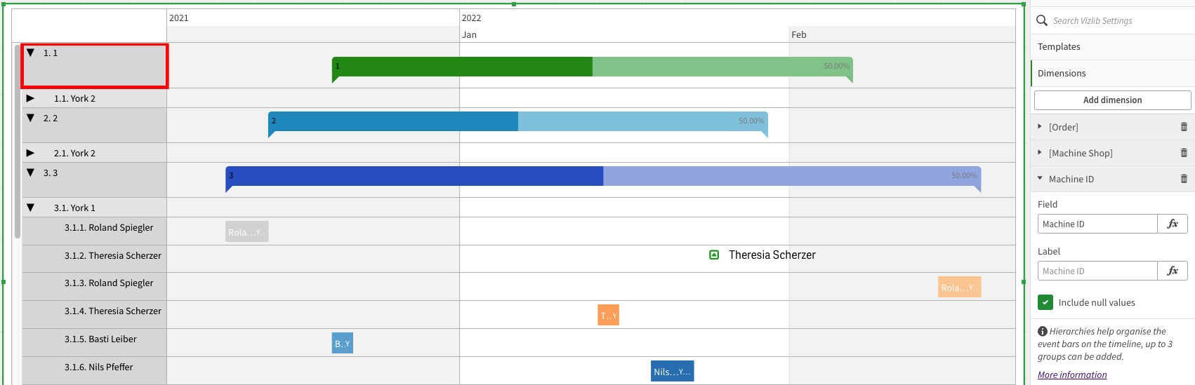
Figure 15.2: Header dimension with collapsed and expanded groups
The Groups section within the Dimension is where you have the option to control some visual settings.
You can Enable and Disable the header group bar by toggling the Group header switch (Figures 16.1 & 16.2).
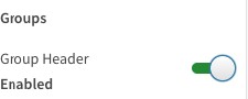
Figures 16.1: Group header bars enabled
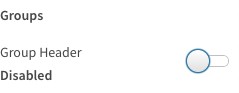
Figures 16.2: Group header bars disabled
Figures 17.1 & 17.2 define how the header bar is colored. Similar to Event color settings, changing from Auto to Custom results in:
-
Auto: The Appearance > Group Header Styling > Colors are applied.
-
Custom: This means the inputted color will override the Appearance color settings.
Note: Group headers cannot be controlled via if() statements. Only static colors can be defined.
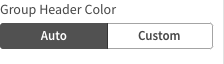
Figure 17.1: Auto color settings
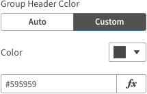
Figure 17.2: Custom color settings
Figure 17.3 shows the outcome when Auto color is applied. The Header color is the same as the highest dimension level. As this example shows, all group bars are red.

Figure 17.3: Auto color applied to color the header bars
When changing the option to Custom, this results in the header bar showing in a different color. As Figure 17.4 shows the lowest-level group has been changed from red to blue.
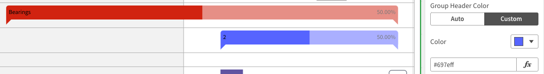
Figure 17.4: Custom color applied to color the lowest level header bar
Figures 18.1 & 18.2 define if the progress value is shown on the group.
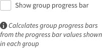
Figure 18.1:
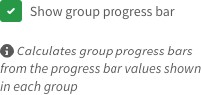
Figure 18.2:
As seen in Figures 18.3 & 18.4, when the Show group progress bar is checked (Figure 18.3) the progress value is shown. When unchecked, the value is not presented (Figure 18.4).
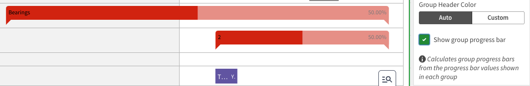
Figure 18.3:
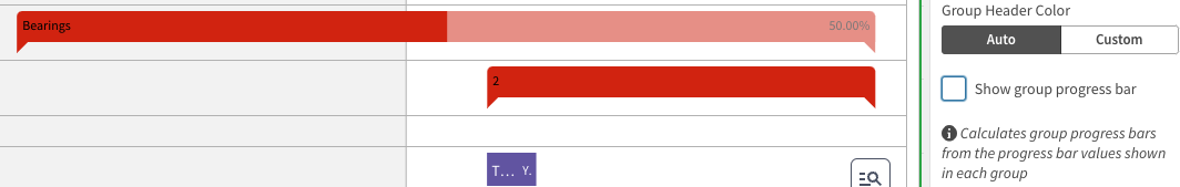
Figure 18.4:
Removing Dimensions
Removing any dimension is done via the bin icon  on the Dimension section.
You can remove any or all groups without resulting in an error; however, if you remove the event dimension, then either undo  the action you just performed or open the Setup Wizard and start again.
Note: If you complete the Setup Wizard process again then setting may change.