Properties - Layers - Barchart
With the Barchart layer you can add your very own customized bar chart to the KPI, using it to display complex information more compellingly. A good example is to add a bar chart as a background behind other objects with added opacity. This article contains details of the settings specific to the barchart layer. You can find more information on the shared settings for layers here.
This topic contains the following sections:
Dimension, Measure
You can add a Dimension and Measure (Figure 1), and specify a sort by either in Sorting by, and customize a Sorting method (Auto is the default). You can also select horizontal and vertical Orientation.
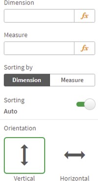

Figure 1: Dimension, Measure
Bars, Grid
You can customize the bars in the chart by setting a Bars Color (Figure 2), enabling a Bars Border, Bars Border Color, Bars Border Width. You can choose to show a Grid, and set the Grid Color.
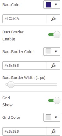
Figure 2: Borders, Grid
X Axis
If you choose to show a label for the X Axis (Figure 3), you can set the X Axis Label Color, the X Axis Label Size, display an X Axis Title (setting the Font Family, X Axis Title, X Axis Title Color, X Axis Title Size and X Axis Title Opacity), show an X Axis Line, set the X Axis Color, the X Axis Opacity and X Axis Thickness.
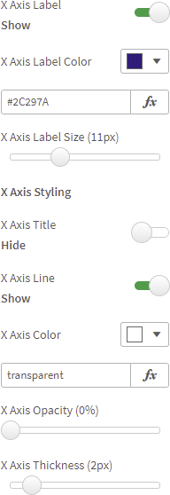
Figure 3: X Axis
You can choose to show X Axis Ticks (Figure 4), setting an X Axis Ticks Color, X Axis Ticks Opacity and X Axis Ticks Size.
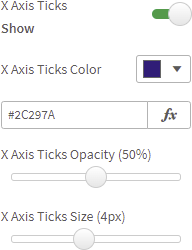
Figure 4: X Axis
Y Axis
If you choose to show a label for the Y Axis (Figure 5), you can set the Y Axis Label Color, the Y Axis Label Size, display an Y Axis Title (setting the Font Family, Y Axis Title, Y Axis Title Color, Y Axis Title Size and Y Axis Title Opacity).
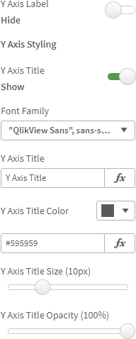
Figure 5: Y Axis
You can show a Y Axis Line, set the Y Axis Color, the Y Axis Opacity and Y Axis Thickness. You can choose to show Y Axis Ticks (Figure 6), setting an Y Axis Ticks Color, Y Axis Ticks Opacity and Y Axis Ticks Size.
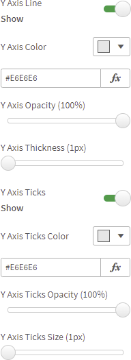
Figure 6: Y Axis Line, Ticks