Properties - Layers - Gauge Chart
A Gauge Chart layer is similar to a pie chart, but with a needle or dial to indicate where your data point(s) fall over a particular range. A useful visualization tool, gauge charts can be used alongside line and bar charts. This article contains details of the settings specific to the gauge chart layer. You can find more information on the shared settings for layers here.
The example here shows a gauge with a range of 0 - 100 and needles to indicate the data points.
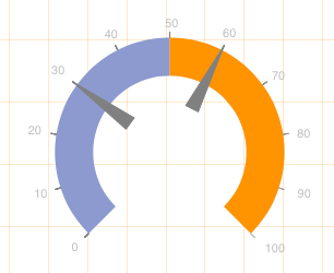
Figure 1: Example
This topic contains the following sections:
Gauge Range
The Gauge Range settings (Figure 2) allow you to set a Min and Max value, set the range to run Clockwise and apply a Format as Number.
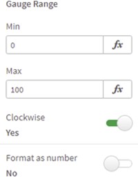
Figure 2: Gauge Range
Gauge Limits
Gauge Limits (Figure 4) allow you to display a limit on the gauge up to a certain value. You can enter a limit name, set the Value, and choose the Limit Color.
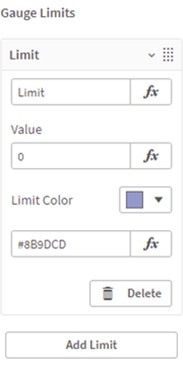
Figure 3: Gauge Limits
Gauge Needles
The settings for Gauge Needles (Figure 4) allow you to add a label with Show Label, choose a Reference Type and enter a Value.
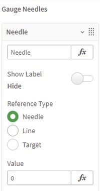
Figure 4: Gauge Needles
You can also set the needle Size, Color and Opacity (Figure 5).
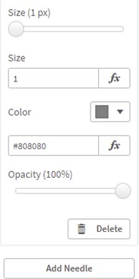
Figure 5: Gauge Needles
Gauge Ticks
You can add Gauge Ticks (Figure 6) to the gauge, choosing a Scale, setting the Tick Font Style Type, Tick Font Color and Tick Font Size.
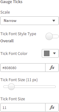
Figure 6: Gauge Ticks