Properties - Measures
Vizlib Pivot Table supports unlimited Measures. You can see an example of how to add measures using the pivot table wizard here.
This topic contains the following sections:
Measure
The first group of settings (Figure 1) shows the Measure name, and a setting to enable Master measure formatting, which means formatting for the measure will be taken from the master item definition (you can find master items in the Custom Objects menu in the left hand panel). You can also enter a Calc. condition to display the measure only if the condition is met, and also set the Measure Visibility without entering a condition.
Note: Master measure formatting is not displayed for measures created using the Fields list.
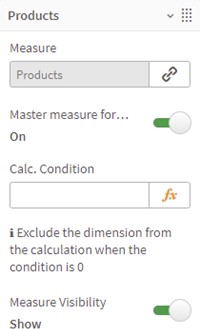

Figure 1: Measure
Representation
Vizlib Pivot Table allows you to choose a Representation; the options are Text, Indicator and Progress. Text representations have no extra settings, while Indicator representations control settings for displaying an icon. There are two Indicator modes: Threshold allows you to set the Icon and Icon Color displayed for values less than, equal to and more than the threshold value, and Expression (Figure 2) allows you to use an expression to control the Icon and Icon Color.
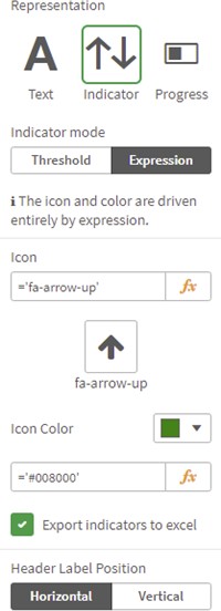
Figure 2: Indicator Expression
If you choose a Progress representation (Figure 3) you'll choose a Bar Scale, Auto or Fixed (entering a fixed value). You can set the Progress Bar Color, show or hide Negative Bars, set Rounded corners and an Overflow border using the sliders, pick an Overflow border color, choose to display a Vertical Axis and pick Show Value.
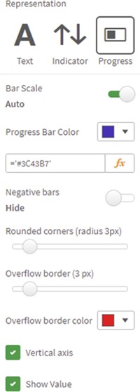
Figure 3: Progress
Styling
For all representation types, you can set the Header Label Position (Figure 4), display the label as plain text, or select Text is HTML or Text is URL. You can also choose a Font Color and choose to Apply Style In Totals Cell or Apply Styles in Title Cell.
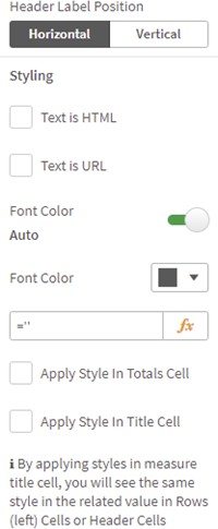
Figure 4: Styling
You can select a custom Font Size, Font Alignment, Font Style and Background Color if you need to, and choose to Apply Style in Title Cell (Figure 5).
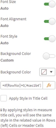
Figure 5: Font
Border, Tooltip
You can choose between Auto and Custom Border settings (Figure 6), choosing a Border Color, whether to Apply Style in Title Cell and set a border Size. If you enable Tooltip, you can choose between auto and custom Tooltip Content, setting a Tooltip Color, and a Tooltip Value for custom content.

Figure 6: Border and Tooltip
Examples
Here's an example to show a pivot table with Indicators (Figure 7) and Progress (Figure 8).
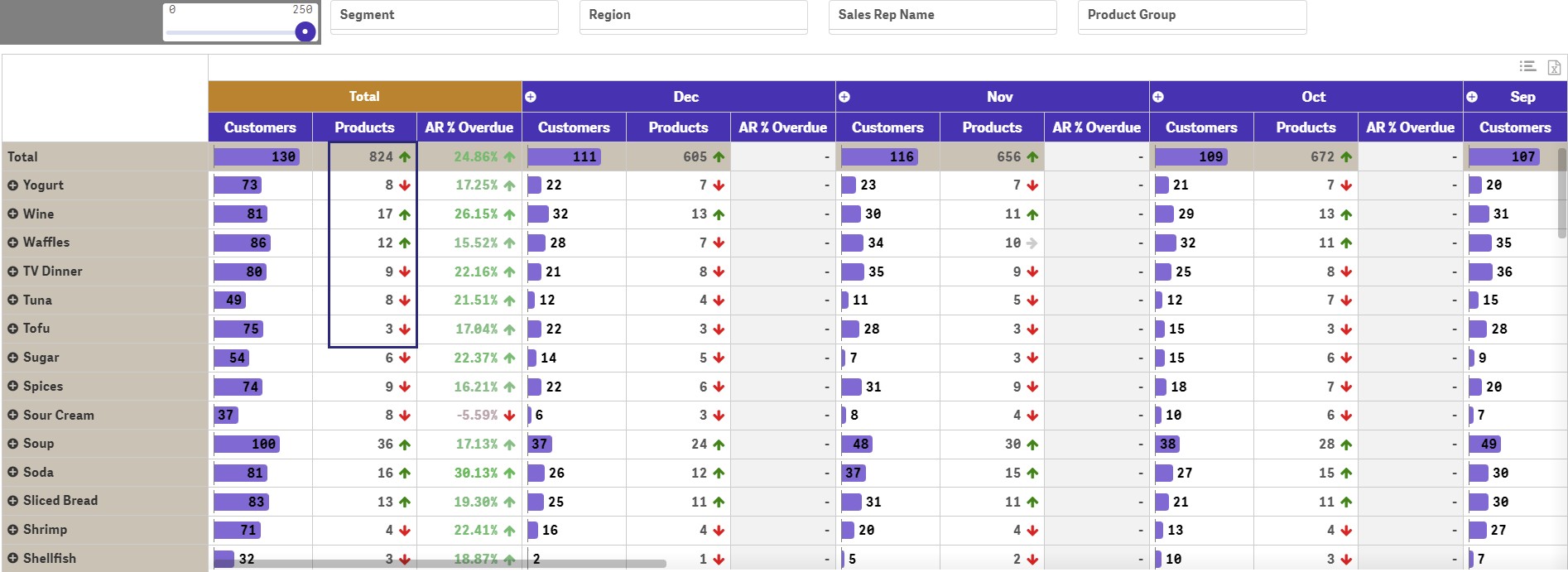
Figure 7: Indicators

Figure 8: Progress