Properties - Appearance
The Appearance properties for Vizlib Tiles manage settings for controlling the look and feel of the visualization, with a wide range of customizable features. If you want to control the appearance of an individual tile, please see the article on the Data section of the property panel here.
The example in Figure 1 shows how easy it is to use appearance settings to change the tile display and applying settings like gradient to a vertical divider, where the color darkens toward the top of each tile.
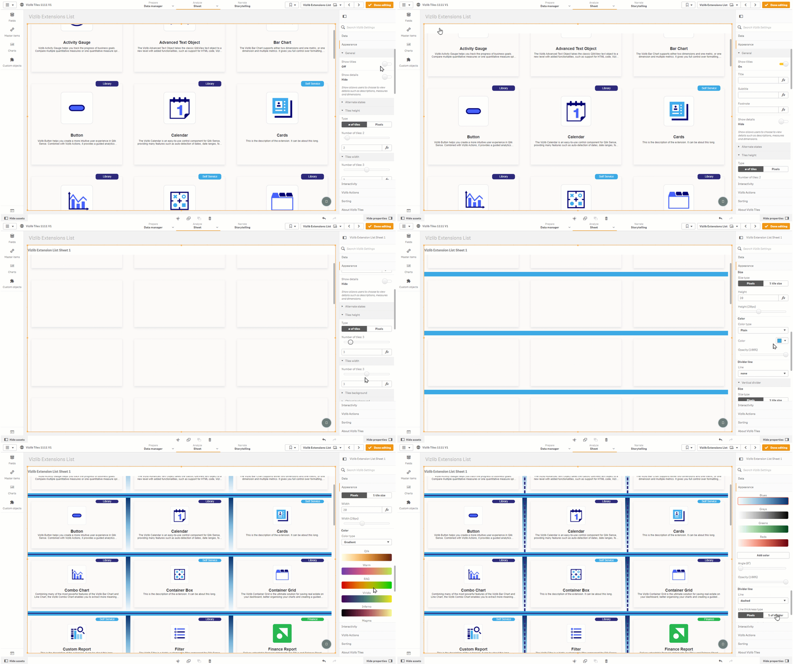
Figure 1: Customizing Appearance
This topic contains the following sections:
General
The General settings (Figure 2) allow you to Show titles for a sheet and also Show details, like descriptions for measures.
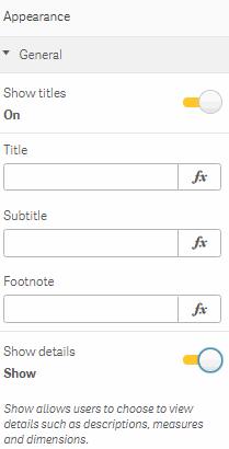
Figure 2: General
Alternate States
Alternate States settings (Figure 3) permit you to assign Vizlib Tiles objects to an alternate selection state. You can find more about alternate states here.
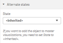
Figure 3: Alternate States
Tiles Orientation
Tiles orientation settings allows control of the scroll direction (Figure 4). The default mode is vertical, which will allow scroll down. In horizontal mode, the Tiles extension will allow scrolling to the right. This is particularly useful if you want one row of tiles to be displayed but the option can be used with any number of rows.
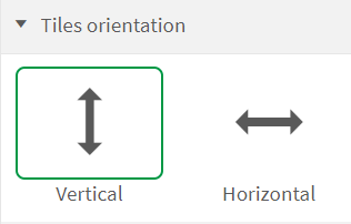
Figure 4: Alternate States 4
Tiles Height/Tiles Width
Tiles Height and Tiles Width (Figure 5) are used to set the number of tiles you see in a row or column, either by using the slider or entering an expression.
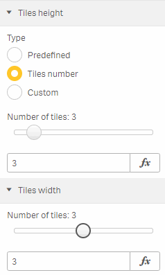
Figure 5: Tiles Height / Tiles Width
Tiles Background
Tiles Background lets you choose between different settings to customize your background.
Plain (Figure 6) allows you to select a Custom Color.
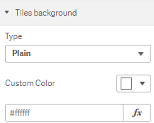
Figure 6: Tiles Background Plain
Sequential (Figure 7) lets you select a specific measure to highlight, and customize the color with Add Color.
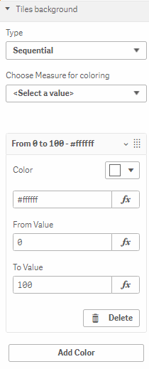
Figure 7: Tiles Background Sequential
Gradient (Figure 8) allows you to vary the shading of the measure according to its layered position within the tile, choosing from a variety of color sets or adding your own.

Figure 8: Tiles Background Gradient
Classes (Figure 9) offers a range of color palettes to choose from, with the option to Reverse colors.

Figure 9: Tiles Background Classes
Object Background
Object Background settings help to customize the background of an object within the tile.
Plain settings (Figure 10) let you select a Custom Color.
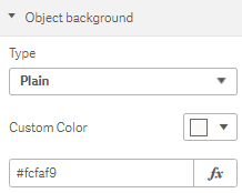
Figure 10: Object Background Plain
If you choose to set your background as an Image (Figure 11) you can use a URL, choose the amount of coverage with Stretch Image, and set vertical and horizontal Image Alignment.
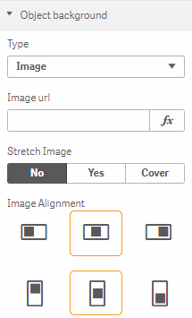
Figure 11: Object Background Image
Gradient background (Figure 12) will use a variety of shades in a color palette according to the Angle setting (e.g. an angle of 0 degrees will shade the object left to right in the palette, starting at the bottom of the object).

Figure 12: Object Background Gradient
Horizontal Divider
The Horizontal Divider settings (Figure 13) are used to customize a divider running horizontally across each column of tiles. You can choose to specify the Size type, the Height, the Color type and Opacity, and select the appearance of the Divider line from a list of options.
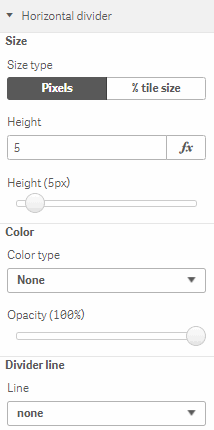
Figure 13: Horizontal Divider
Vertical Divider
The Vertical Divider settings (Figure 14) are used to customize a divider running horizontally across each column of tiles. You can choose to specify the Size type, the Width, the Color type and Opacity, and select the appearance of the Divider line from a list of options.
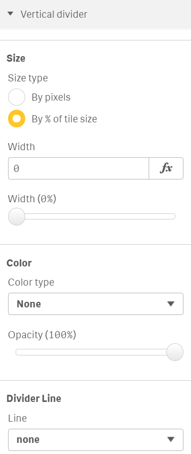
Figure 14: Vertical Divider
Margin and Shadows
You can use Margin and Shadows settings (Figure 15) to enable Scroll Fade to Show Fade in/out scroll, pick a Fade Color, set the Size Type to Relative or Fixed, enter the size of the Margin, Enable shadows if you want to, set the Shadow Color, vary the appearance relative to the X and Y Axis with X Offset and Y Offset (pixel count starts at 0 from the bottom left of the object), Blur the Y Axis margin with Y Blur, and Spread the margin between each tile object.
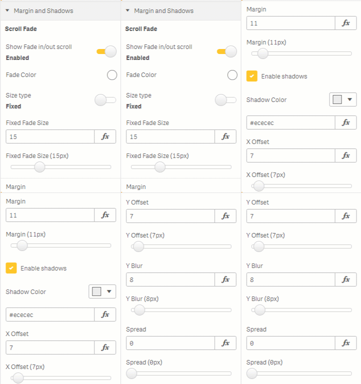
Figure 15: Margin and Shadows
Borders
With Borders settings (Figure 16), you can select which sides of the tile you'd like to show with a border, select a Border Style from a list of options, and set the Tile Border Color, Tile Border Width, and Tile Corner Radius.
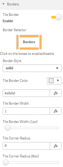
Figure 16: Borders