Data - Dimensions and Measures
The Data section of the property panel helps you to create and manage settings for the data used in Vizlib Tiles.
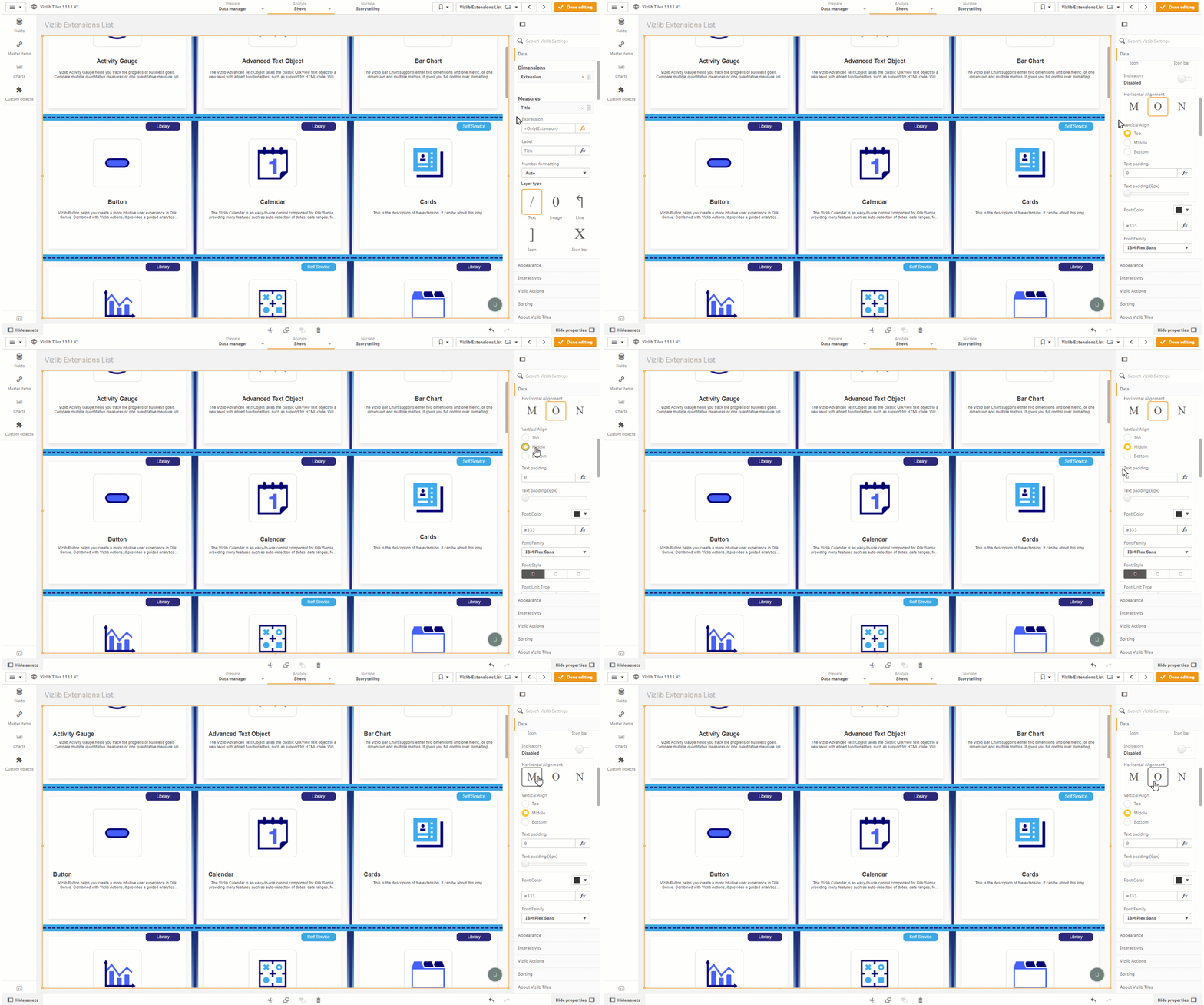
You can use one dimension to define your tile object and then use measures to layer properties on the tile. Layering is a method of organizing the tile elements, where you can move individual measures to the front or back of the tile, and also customize settings for each measure, like font size or background color. You can see an example in Figure 1, where changes are made to the Title measure layout.
Figure 1: Customize Measure Example
This topic contains the following sections:
Dimensions
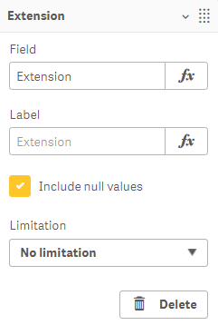
Figure 2 shows a Dimension used in Vizlib Tiles. You can customize the Field and Label, and allow null values to be used. The Limitation drop-down controls the number of tiles in the display.
-
No limitation - every tile object is displayed.
-
Fixed number - display a fixed number of tiles, choosing either from the top or bottom of the range.
-
Exact value - display an exact value.
-
Relative value - display a percentage.
Figure 2: Dimension
Measures
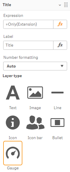
Measures in Vizlib Tiles control the tile Elements and up to 50 can be used in a single sheet. Figure 3 shows the main settings for a Title measure, the Expression used to define the title, the Label for the title display, the Number formatting option (choose from Auto, Number, Money, Date, Duration, Custom and Expression), and the Layer Type (Text, Image, Line, Icon, Icon bar, Bullet and Gauge). Because the title is a text value, Text is selected here, although HTML can be also added in the Expression field.
Figure 3: Measures - Title
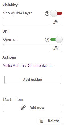
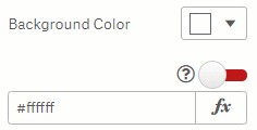
Note: A gauge has been introduced for some measure settings which use an expression editor (Figure 4) with two options: Green or Red.
Figure 4: Calculation Gauge
-
Green - the expression is evaluated once for the entire extension. Please use this setting whenever possible.
-
Red - the expression evaluates once per tile. Please use this setting only when necessary as this can negatively impact on performance.
Text
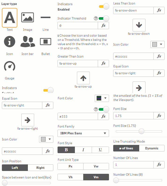
Text layer types (Figure 5) display text in the footer, and you can enable an Indicators setting which lets you display icons which rank the element values against a Threshold. There are three icons to choose from: Greater Than, Less Than and Equal to. You can choose the Icon symbol and Icon Color by clicking the icon symbol or color palette, or by entering an expression, as well as set the Icon Position and the Space between icon and text. Selecting a Horizontal Alignment (left, centre or right) or Vertical Align (Top, Middle or Bottom) lets you set the element position within the cell. You can set a level of Text Padding around the title label, and choose a Font Color, Font Family, Font Style, Font Unit Type and Font Size. There is also a setting to choose the Line Truncating Mode.
You can additionally mark the Respect line breaks checkbox. With this option, any line breaks are respected and properly displayed on the tile.
Figure 5: Text Layer
Image
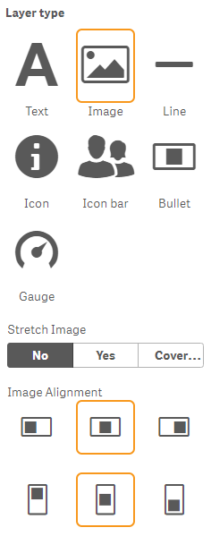
Image layers (Figure 6) display an image, and can be customized using Stretch Image settings and the Image Alignment.
Figure 6: Image Layer
Line
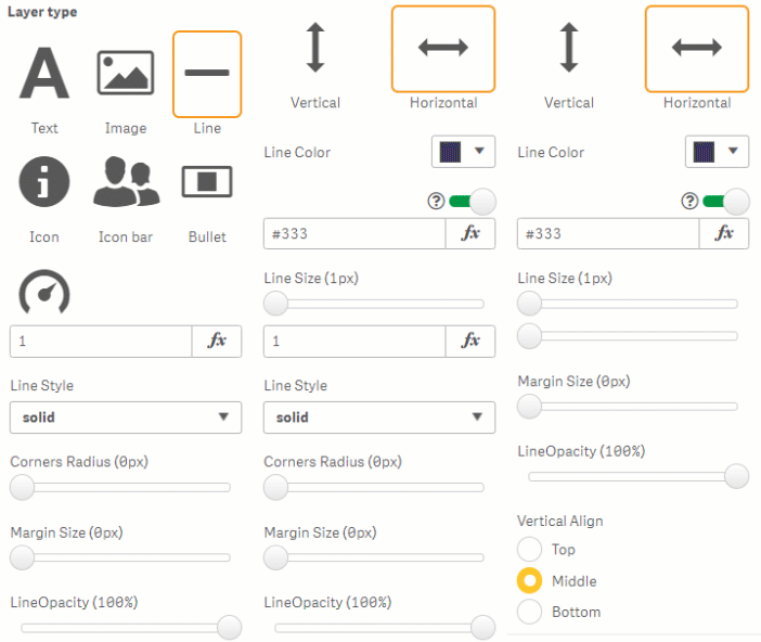
Line layers (Figure 7) display a line, and have settings controlling the line orientation, select the Line Color, Line Size, Line Style, the Corners Radius, Margin Size, vary the line visibility with Line Opacity, and set the Vertical Align.
Figure 7: Line Layer
Icon
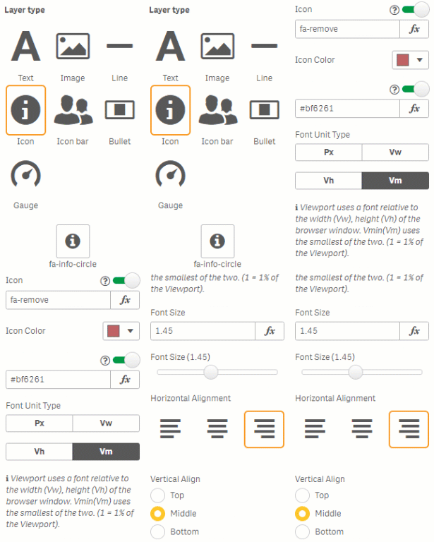
Icon layers (Figure 8) display an icon, with settings to select the Icon, the Icon Color, the Font Unit Type, and the Font Size. Selecting a Horizontal Alignment (left, centre or right) or Vertical Align (Top, Middle or Bottom) lets you set the element position within the cell.
Figure 8: Icon Layer
Icon Bar
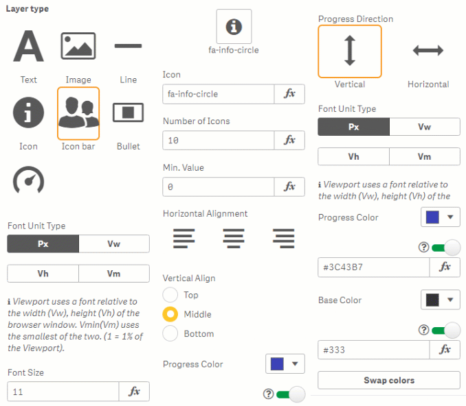
Icon Bar layers (Figure 9) display an icon bar (a collection of icons) which can be used to display results on a scale (e.g. number of stars out of five). There are settings to select the Icon, the Number of Icons, the icon bar Minimum Value and Maximum Value, the Progress Direction, the Font Unit Type, Font Size, choosing to Wrap Icons Color, the Font Unit Type, and the Font Size. Selecting a Horizontal Alignment (left, centre or right) or Vertical Align (Top, Middle or Bottom) lets you set the element position within the cell, and you also choose a Progress Color, a Base Color and even Swap Colors if you want.
Figure 9: Icon Bar Layer
Bullet
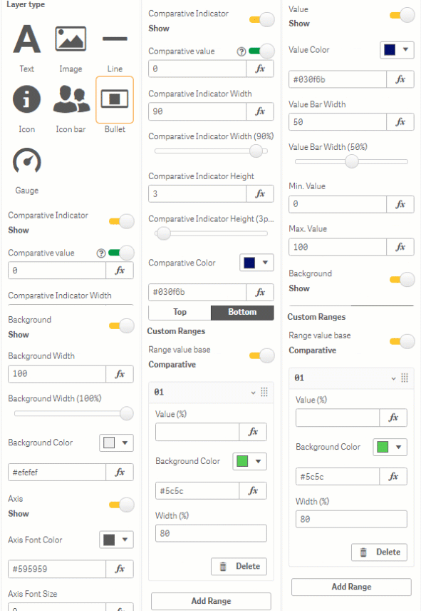
Bullet layers (Figure 10) display a bar with bullets (markers) showing progress towards a goal. You can choose to show a Comparative Indicator, setting the Comparative value, Comparative Indicator Width, Comparative Indicator Height, and Comparative Color. Enabling a bullet Value allows you to set the Value Color, Value Bar Width, Min. Value and Max. Value. Bullet Background settings let you set the Background Width and Background Color. Displaying an Axis for the bullet layer lets you set the Axis Font Color, Axis Font Size, Axis Font Family, and Axis Position. Enabling Custom Ranges and clicking Add Range lets you add a range, with settings for a Value, Background Color and Width.
Figure 10: Bullet Layer
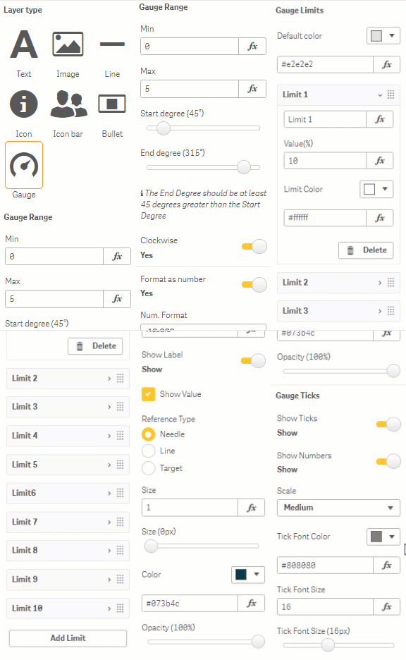
Gauge
Gauge layers (Figure 11) display a gauge view for results. You can set the Min and Max values for the Gauge Range, as well as a Start Degree and End Degree, setting the gauge progression as Clockwise, choosing a Num. Format, showing a Currency Format, and a number Position. Settings for Gauge Limits include a Default Color, a limit label, Value and Limit Color. You can enter a Name and show a Label for the Gauge Needle, setting a Reference Type, Size, Color and Opacity. You can also display Gauge Ticks showing Ticks and Numbers, and choose the Tick Font Color, and Tick Font Size.
Figure 11: Gauge Layer
Mini Chart
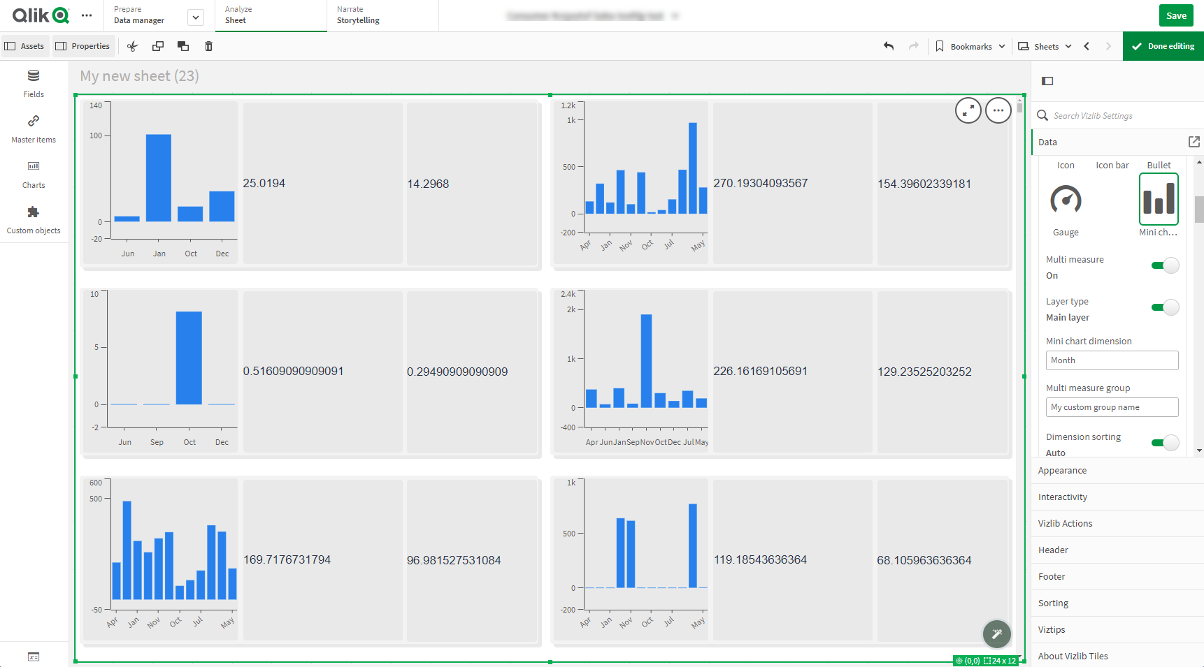
Vizlib Tiles 2.9.0 adds the Mini Chart option to the Layer type setting on the user interface in Vizlib Tiles. You can choose the Mini Chart to be either a Bar Chart or a Line Chart. The Mini Chart layer enables you to view and present data in the context of a chosen element on the Tiles.
Figure 12: Mini Chart Layer.
Create A Simple Mini Chart With Vizlib Tiles
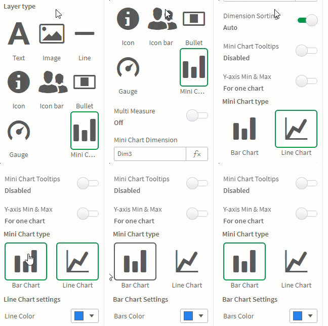
The Mini Chart layer enables you to choose the Bar Chart and Line Chart as layer types. Before you uncover all the capabilities of Vizlib Tiles 2.9.0, insightsoftware recommends you create a simple chart based on one measure. To create a simple Bar Chart or Line Chart associated with a selected measure, follow the below instruction:
-
Go to the Properties Panel > Data > Measures and select the specific Measure. The settings for further configuration are displayed.
-
Go to the Layer Type and select the Mini Chart tile. The Mini Chart settings are displayed.
-
Go to Mini Chart type and select either the Bar Chart or Line Chart tile, depending on your preference. The Bar Chart or Line Chart visual settings are displayed.
-
Define the Dimension for the Mini Chart.
You have created a simple chart based on a single measure. You can adjust the visual settings according to your preference. The following visual settings are available:
| Chart | Settings |
|---|---|
|
Bar Chart |
|
|
Line Chart |
|
|
Bar Chart and Line Chart |
|
Create A Multi-Layer Chart
You can create visualizations in Vizlib Tiles based on multiple measures. This way, each measure constitutes a separate layer on the tile. To create such a multi-layer chart, go to the Properties Panel > Data > Measures and add more Measures. By defining the desired layer type for each Measure and configuring visual settings, you can achieve a diverse visualization.
Figure 13: Three measures visualized in Vizlib Tiles using the Mini Chart (Bar Chart) and Text layer types.
Create A Multi-Measure Visualization
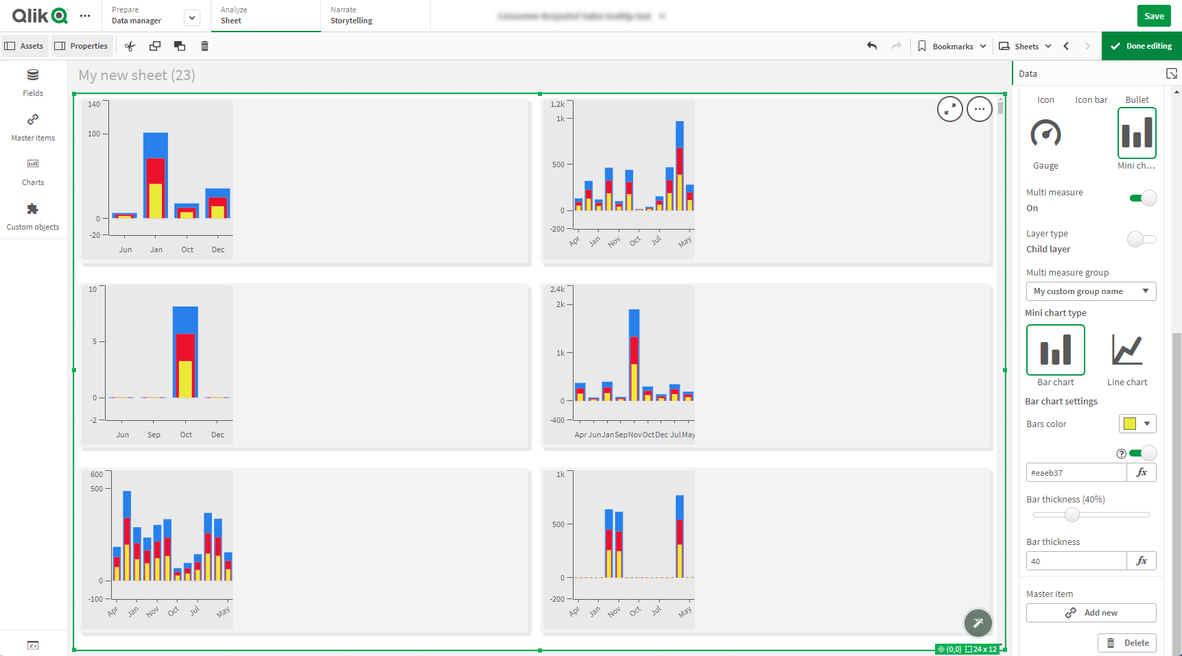
Before you move on to creating more complicated visualizations, insightsoftware recommends you read how to Order Your Multi-Measure Visualization Properly. When you have a multi-layer chart, you can create an all-in-one visualization for the measures on the tile. You can start by enabling the Multi Measure option in Properties Panel > Data > Measures > Mini Chart. If you set the Multi Measure option to on, the measure visualizations are merged into one.
Note: The Multi Measure option works only for measures visualized using the Mini Chart layer type.
After enabling the Multi Measure option, you need to define the Multi Measure Type for each measure you include in the visualization. You can choose between the following settings:
-
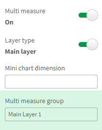
Main Layer – a parent measure in the chart. One group can have only one Main Layer.
-
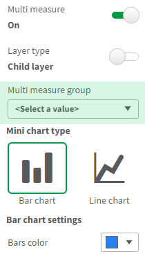
Child Layer – a child in a specific group defined under the Multi Measure Group. Child Layers take all general settings, like dimension or sorting from the Main Layer of the specific group. There can be multiple Child Layers within the specific group and all of them are rendered in the same chart.
To group all the Child Layers under the specific group, define the name of the Multi Measure Group under the Main Layer.
Figure 14: Multi-Measure Group setting in the Main Layer
To assign Child Layers to the defined Multi Measure Group, go to a selected Child Layer and from the drop-down list, select the name of the defined group.
Figure 15: Multi-Measure Group setting in the Child Layer
You can configure visual settings differently for each layer on the Multi Measure visualization.
Figure 16: Multi-Measure visualization in Vizlib Tiles.
Order Your Multi-Measure Visualization Properly
insightsoftware recommends starting the visualization process from the Main Layer, regardless of the position it has on the list of Measures in the Properties Panel. Then, you need to follow the order of Measures on the list in the Properties Panel, starting from the top. Please, see the example below for reference.
Figure 17: Sample visualization order.
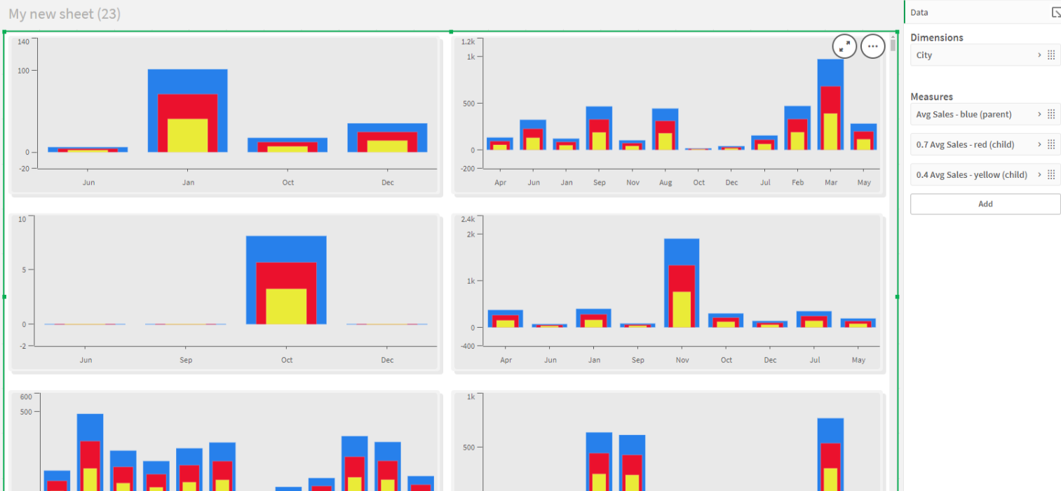
The Main Layer (here parent) marked in blue is at the top of the list but has the lowest position on the visualization. As it is the biggest element on the chart, having it as the top layer would cover all the Child Layers. When you have completed visualizing the Main Layer, you need to visualize the Child Layers starting with the one that has higher position on the list – in this case marked in red.
If at any point of the process, your visualization does not display as expected, insightsoftware recommends checking if you have followed the above guidelines.
Background Color
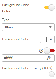
Background Color settings apply to all layer types (Figure 12), you can select one from the color palette or entering an expression. You can also select a level of Background Color Opacity.
Figure 18: Background Color
Layer Border
Layer Border settings (Figure 13) apply to all layer types. You can set up the border location with the Border Selector, choose a Border Style, and select a Layer Border Color, Layer Border Width, and Layer Corner Radius.
Figure 19: Measures - Layer Border

Enable Tooltip
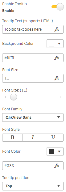
If you choose to Enable Tooltip (Figure 14), you can enter a Tooltip Text string, and set a Background Color, Font Size, Font Family, Font Style, Font Color and Tooltip Position.
Figure 20: Measures - Enable Tooltip
Enable or Disable All Tooltips
When you have multiple layers in your visualization, it may be difficult to locate the tooltips, and enable or disable them individually. That's why insightsoftware has introduced the possibility to enable and disable all tooltips, regardless of their current state, whether disabled or enabled. You can enable or disable all tooltips using the dedicated button in the Property Panel > Interactivity. The feature applies to Vizlib Tiles 2.10.0 and above.
Figure 21: Button to enable and disable tooltips
Position
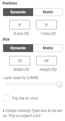
You can choose between two modes to set the layer Position and Size.
-
Dynamic - size and position stay proportionate to the tile size e.g. if the tile width increases, the layer width also increases.
-
Static - size and position are fixed, and do not change if the tile is re-sized (Figure 15) e.g. an object placed in a particular corner will keep that position.
You can set the Layer opacity using the slider, and also select Flip Tile on Click, which you use when you enable Viztips for the extension and select Flip on Object Click as the Viztips Visibility Type.
Figure 22: Measures - Tooltip Position
Visibility/Actions
You can choose to make the layer Visibility dependent on a condition with Show/Hide Layer, use Open URL to link an individual tile to a distinct URL, and integrate the layer with Vizlib Actions by clicking Add Action (Figure 16). You can read more about Vizlib Actions here.
Figure 23: Measures - Actions / Master Items
