Properties - Appearance
The Appearance tab manages settings relating to the look and feel of your Vizlib Toolbar object.
Note: If you want to change any color settings, you'll use the color picker. You can find a complete guide to using the color picker here.
This topic contains the following sections:
General
In the General tab (Figure 1), you can choose to show or hide a title, add title details using the expression editors and show or hide toolbar details.
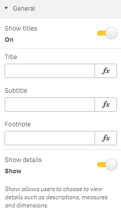
Figure 1: General
Alternate States
Alternate States has settings related to adding the object to master visualizations (Figure 2). You can find more information about working with alternate states here.
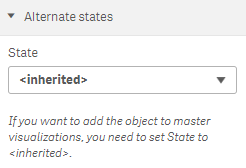
Figure 2: Alternate States
Font Settings
The Font settings (Figure 4) sets properties for the Font color, Font family, Font style and Font size. If you choose a Responsive Font size, the font will change size if the toolbar object is re-sized. Using responsive text is the preferred alternative and make sure to use the same option throughout the Toolbar to avoid some texts not changing size.
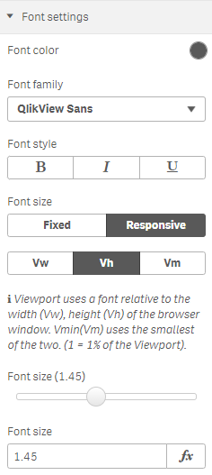
Figure 4: Font Settings
Colors
The Colors settings (Figure 3) let you select the colors for Toolbar background, Element background, Item background and Borders, using the Color Picker.
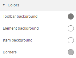
Figure 3: Colors
Label Settings
When Show labels is activated, the Label Settings (Figure 5) allow you to display a label and set the label Position, Font color, Font family, Font style and Font size. If you choose a Responsive font style, the font will change size if the toolbar is re-sized.
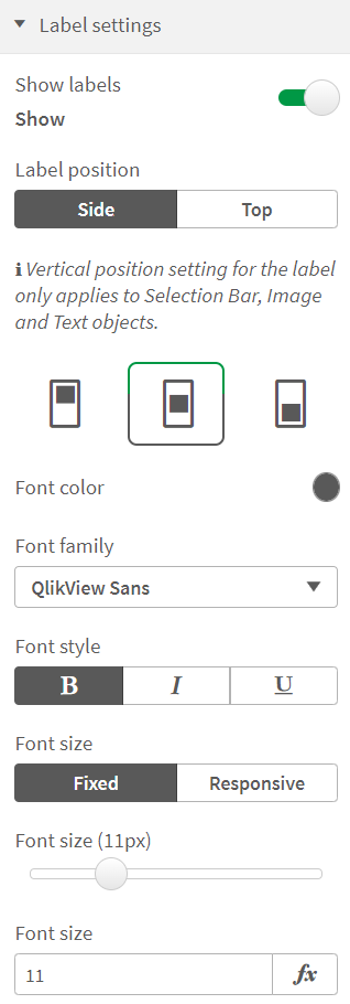
Figure 5: Label Settings
Layout Settings
The Layout Settings (Figure 6) contains sliders which allow you to set the Margin between elements and the Elements padding (the area between each element). The padding is split into four different settings to allow you to set the Top, Bottom, Left and Right padding independently. For centered alignment, make sure to set the padding to the same number for Top/Bottom and Left/Right, respectively.
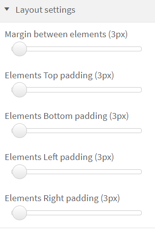
Figure 6: Layout Settings