Properties - Element List - Actions
In Vizlib Toolbar, the Element List can also be used with Vizlib Actions. You can find out all about Vizlib Actions here.
Note: If you want to change any color settings, you'll use the color picker. You can find a complete guide to using the color picker here.
This topic contains the following sections:
Choose Input - Actions
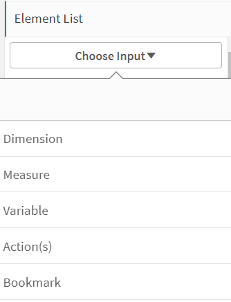
To add an Actions element in Vizlib Toolbar, go the Choose Input setting and select Action(s) from the drop-down (Figure 1). You'll create a new element in the property panel Element List.

Figure 1: Choose Input
Output Type, Label Settings, Button Settings
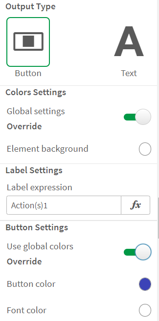
The Actions controls (Figure 2) show the Output Type. The only option currently available is Button. There are also Label Settings, where you can edit the label displayed in the toolbar, and the Button Settings, where you can choose to Use global colors, or Override the global settings and choose a Button color and Font color using the color picker.

Figure 2: Output Type, Label Settings, Button Settings
Icon
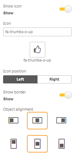
Figure 3 shows the controls for displaying an icon, which you activate with the Show icon toggle. You can choose the Icon from a list, set the Icon position, enable Show border, and set the Object Alignment (there are separate options for horizontal and vertical alignment).

Figure 3: Icon
Actions
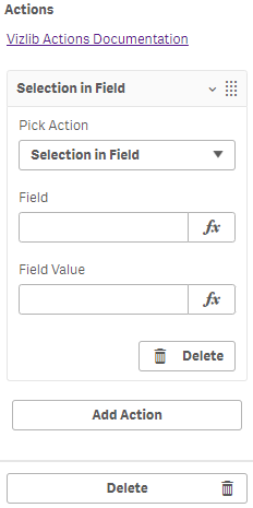
Vizlib Actions settings (Figure 4) allow you to link actions to the toolbar element. Click Add Action, then select an option in Pick Action and enter information for a Field and Field Value if you need it. You can find out more about Vizlib Actions here.

Figure 4: Actions
Text
Text settings (Figure 5) allow you to add any text by simply including it in the measure.

Figure 5: Text