Properties - Element List - Variables
In Vizlib Toolbar, you can use variables to add to the Element List.
Note: If you want to change any color settings, you'll use the color picker. You can find a complete guide to using the color picker here.
This topic contains the following sections:
Choose Input - Variable
To add a variable in Vizlib Toolbar, go the Choose Input setting and select Variable from the drop-down (Figure 1). You'll create a new element in the property panel Element List. Variables will have the letter v added to the start of the element name as a default (this article uses a default of vSlider).
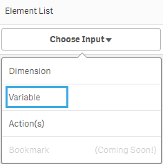
Figure 1: Choose Input
Variable - Number Formatting and Output Type
When you open the new element settings, you'll see the Variable label, and a choice of Number formatting options. There's also a choice of six output types: Selection Bar, Dropdown, Input Box, Calendar, Switch and Slider (Figure 2). Click on the Output Type you want to use to select it (in Figure 2, the slider is selected).
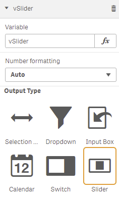
Figure 2: Output Type
Selection Bar
The selection bar Label Settings (Figure 3) allow you to enter a Label Expression, choose to override the global Layout Settings, display a List Label, and select a Label Position. You can also set the label Font color with the color picker, choose the Font family, Font style, and Font size, and enter comma separated Variable values. If you choose a Responsive Font size, the font will change size if the toolbar object is re-sized.
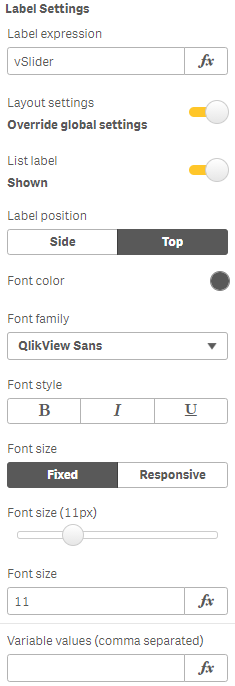
Figure 3: Selection Bar Label
The Selection Bar Settings (Figure 4) contain controls for the Button type, selection bar Orientation, a choice of whether to Wrap the selection bar items, set a Value Width, and select the vertical and horizontal Alignment.
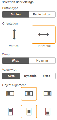
Figure 4: Selection Bar Settings
Dropdown
Dropdown Label Settings (Figure 5) allow you to enter a Label Expression, display a List Label, and select a Label Position. You can also set the label Font color with the color picker, and choose the Font family, Font style, and Font size. If you choose a Responsive Font size, the font will change size if the toolbar object is re-sized.
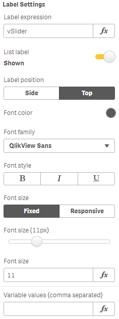
Figure 5: Dropdown Label
The Dropdown Settings (Figure 6) allow you to choose a Max dropdown height, set a dynamic Dropdown width or customize it to include a Max dropdown width and Min dropdown width, select a Cell height, and choose the Alignment for the dropdown items.
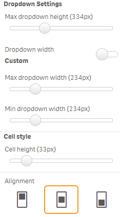
Figure 6: Dropdown Settings
Input Box
Input box Label Settings (Figure 7) allow you to enter a Label Expression, choose to override the global Layout Settings, display a List Label, and select the Label Position. You can also set the label Font color with the color picker, and choose the Font family, Font style, and Font size. If you choose a Responsive Font size, the font will change size if the toolbar object is re-sized.
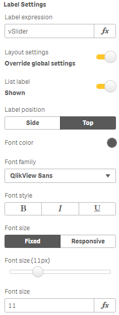
Figure 7: Input Box Label
The Input Box Settings (Figure 8) allow you to select a Submit Type, choose the Focused color and Outline color using the color picker, set the Object Alignment, and choose the Input Width using the slider.
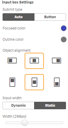
Figure 8: Input Box Settings
Calendar
Calendar Label Settings (Figure 9) allow you to enter a Label Expression, choose to override the global Layout Settings, display a List Label, and choose a Label Position. You can also set the label Font color with the color picker, and choose the Font family, Font style, and Font size. If you choose a Responsive Font size, the font will change size if the toolbar object is re-sized. You can also enter start and end dates in Variable values (date from) and Variable values (date to).

Figure 9: Calendar Label
Calendar Settings (Figure 10) allow you to customize a Date format mode, display Month/Year drop-downs and set the Object alignment.
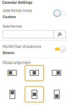
Figure 10: Calendar Settings
Switch
Switch Label Settings (Figure 11) allow you to enter a Label Expression, choose to override the global Layout Settings, display a List Label, and choose a Label Position. You can also set the label Font color with the color picker, and choose the Font family, Font style, and Font size. If you choose a Responsive Font size, the font will change size if the toolbar object is re-sized.
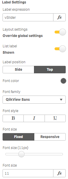
Figure 11: Switch Label
Switch Settings (Figure 12) allow you to select an Unchecked value and Checked value, choose the Checked color, Unchecked bar color and Unchecked thumbnail color using the color picker, and set the Object Alignment.
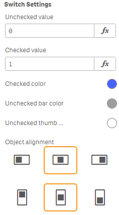
Figure 12: Switch Settings
Slider
Slider Label Settings (Figure 13) allow you to enter a Label Expression, choose to override the global Layout Settings, display a List Label, a Legends Label and choose a Label Position. You can also set the label Font color with the color picker, and choose the Font family, Font style, and Font size. If you choose a Responsive Font size, the font will change size if the toolbar object is re- sized. If you choose to have Defined values, (see below) you'll also see an option to enter Variable values (comma separated).

Figure 13: Slider Label
Slider Settings allow you to choose from two Slider types: Numerical and Defined values. If you choose Numerical (Figure 14), you can set the Orientation, Alignment, Min slider value and Max slider value. You can also choose the Dot color, Gradient colors (Linear or Gradient settings) and the Start color and End color using the color picker.
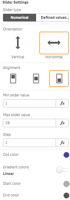
Figure 14: Slider Numerical Settings
If you choose Defined values (Figure 15), you can set the Orientation, Alignment, and also choose the Dot color, Gradient colors (Linear or Gradient settings) and the Start color and End color using the color picker.
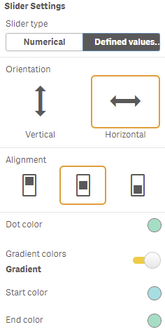
Figure 15: Slider Defined Values Settings