Properties - Interactivity
Interactivity controls the settings used to interact with toolbar data when you're using Qlik Sense in analysis mode.
Note: If you want to change any color settings, you'll use the color picker. You can find a complete guide to using the color picker here.
This topic contains the following sections:
Interactivity
The first set of Interactivity controls (Figure 1) are toggles for displaying a Fullscreen Icon and a Snapshot Icon. There is also a button to select one of the three types of Collapsed Mode. There are three types of collapsed mode to choose from: Expand, Slide In and Floating. Enabling collapsed mode saves display space in analysis mode, and shows the full toolbar only when it's required.
Note: Since the Qlik Sense September 2020 release, the Snapshot Icon is no longer controlled by the property panel. It can be found in the Hover menu when the sheet is in analysis mode.
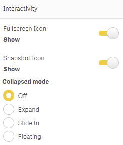
Figure 1: Interactivity
Expand
Expand mode (Figure 2) displays a button instead of the toolbar object. Clicking the button will reveal the full toolbar. You can use the Button Settings to enter Text, and set a Button color and Font color, either by choosing to Use global colors or enabling Override to choose your own colors using the color picker.
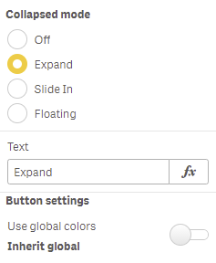
Figure 2: Collapsed Mode Expand
If you want to show an icon, you can activate these settings (Figure 3) with the Show icon toggle. You can choose the Icon from a list, choose the Icon position, enable Show border, set a Corner radius, Border width, Border color and choose the icon Width and Height.
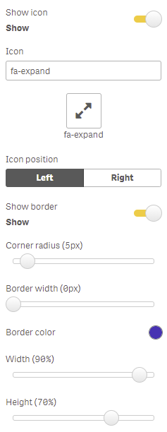
Figure 3: Icon Settings
Slide In
Slide In settings (Figure 4) display a tab, and the settings "slide" from the tab when you click it. You can enter display Text, choose the Collapsed Mode position for the tab (Top or Left), and choose whether the Size should be Dynamic (changing size with the object) or Fixed. You can also set the Length as a percentage of the overall size (Dynamic) or in Pixels (Fixed).
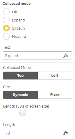
Figure 4: Slide In
Floating
Floating settings (Figure 5) display the toolbar in a panel which "floats" on the sheet and can be dragged into a different position as required. You can use the Button Settings to enter Text, and set a Button color and Font color, either by choosing to Use global colors or enabling Override to choose your own colors using the color picker. You can also enable Show icon, selecting a display icon from the list and choosing the Icon position.
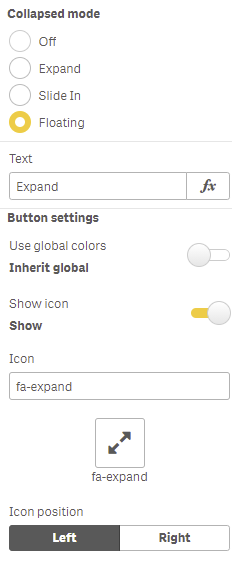
Figure 5: Floating
You can also display a border by enabling Show border (Figure 6) to set a Corner radius and Border width, and choose a Border color, Width and Height. The Floating settings let you enter a Modal header title, Initial height and Initial width.

Figure 6: Border, Floating Settings
Setting the Size of the Minimized Toolbar
You can use the Grid Spacing controls at sheet level in the Sheet properties section (Figure 7) to change the size of the minimized toolbar for Expand, Slide-in and Floating modes. Selecting a Narrow setting will make the minimized item smaller.
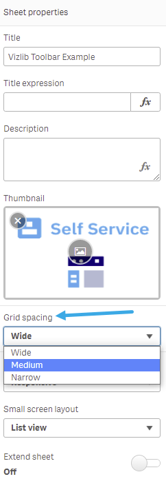
Figure 7: Sheet properties