Properties - Appearance
You can use the Appearance menu in the Property Panel to manage and customize the look and feel of your Vizlib Switch objects. You can find the menu under Switch Items (Figure 1).
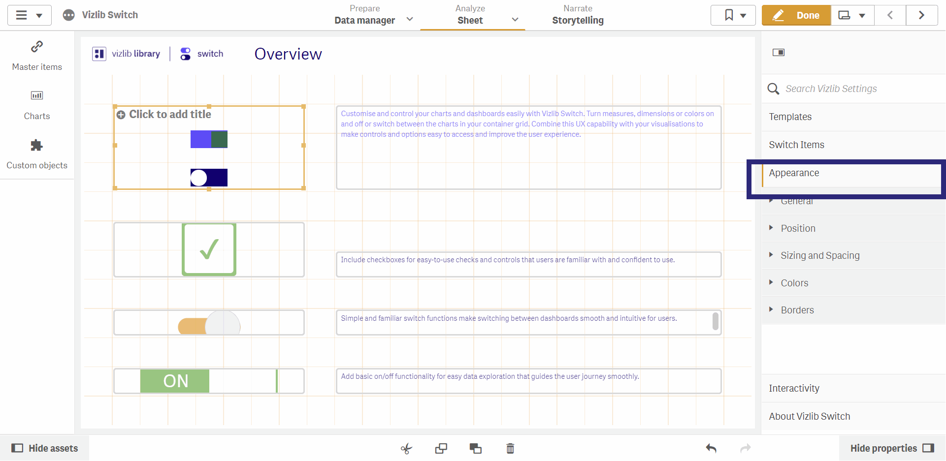
Figure 1: Appearance Menu
You can find out more about Vizlib Switch in our Overview.
This topic contains the following sections:
General
The General section has two main operations, which you enable by moving the toggle right. You can choose to Show titles, and enter your own text for a Title, Subtitle or Footnote. You can also opt to Show detail, which will display details on any data added (e.g. measures or dimensions).
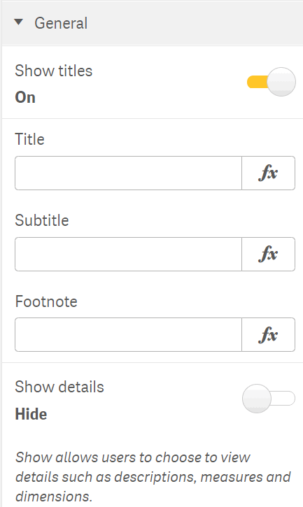
Figure 2: General
Position
The Position menu helps you to set the position of the Switch object in the sheet (Figure 3). You can set the Orientation (vertical, horizontal), the Horizontal alignment and the Vertical alignment.
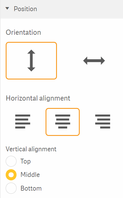
Figure 3: Position
Sizing and Spacing
Sizing and Spacing settings are enabled by default, but you can disable them if you need to customize them.
Sizing settings control the size of the switch items you've used (Figure 4). There are settings for the height and width of the bar (the background) and control (the "switch"), so in this example the bar would be 50 pixels wide and 24 pixels high.
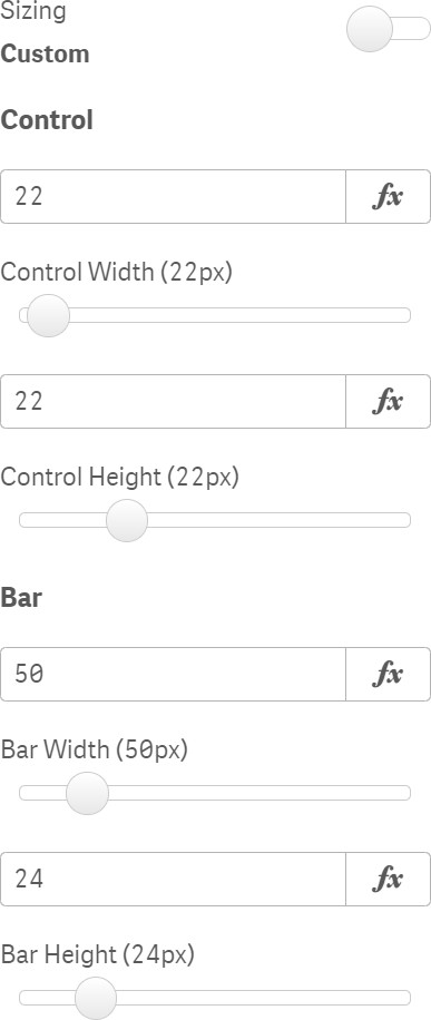
Figure 4: Sizing
Note: For more information on the bar and control elements of an items, see our Switch Items article here.
Spacing settings manage the space between each switch item (Figure 5), so in this example each item would be spaced 15 pixels apart.
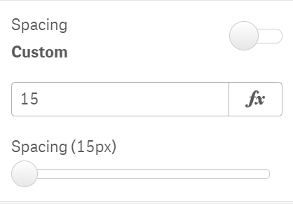
Figure 5: Spacing
Colors
For Bar and Control Colors settings, the menu is enabled by sliding the toggle to the right. For both of the elements, there are settings for the Active Color and Inactive Color.
Figure 6 shows the panel for Control Colors.
You can also choose to enable a transparent background or hide borders in certain situations.
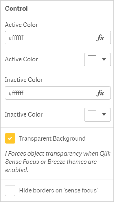
Figure 6: Colors
Borders
For Bar and Control Borders settings, the menu is enabled by sliding the toggle to the right, and they are the same for both of the elements.
Figure 7 shows the controls for Control Borders.
You can set the Border Radius, Border Size and Color.
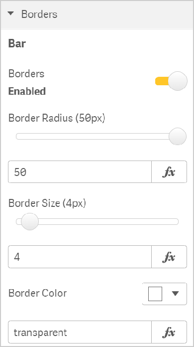
Figure 7: Custom Borders